BACK
TAI Academy
Tai Academy
Designing an all-in-one multimedia entertainment platform for animation, podcasts, audio stories, music, and digital comics — built for offline-first users across mobile, desktop, and web
My Role | Duration | Platforms | Status | Team |
UX/UI Designer | 3 Weeks | Mobile, Desktop, Web | Active | TAI Tanzania |
One platform, every format
Tai Academy is a Tanzanian multimedia entertainment platform that brings together animation videos, podcasts, audio stories, music, and digital comics under one roof. Unlike services that specialize in a single format, Tai Academy needed to serve users who consume a wide variety of content including those with inconsistent internet access.
What I designed
Consumer App (Mobile+ Web):
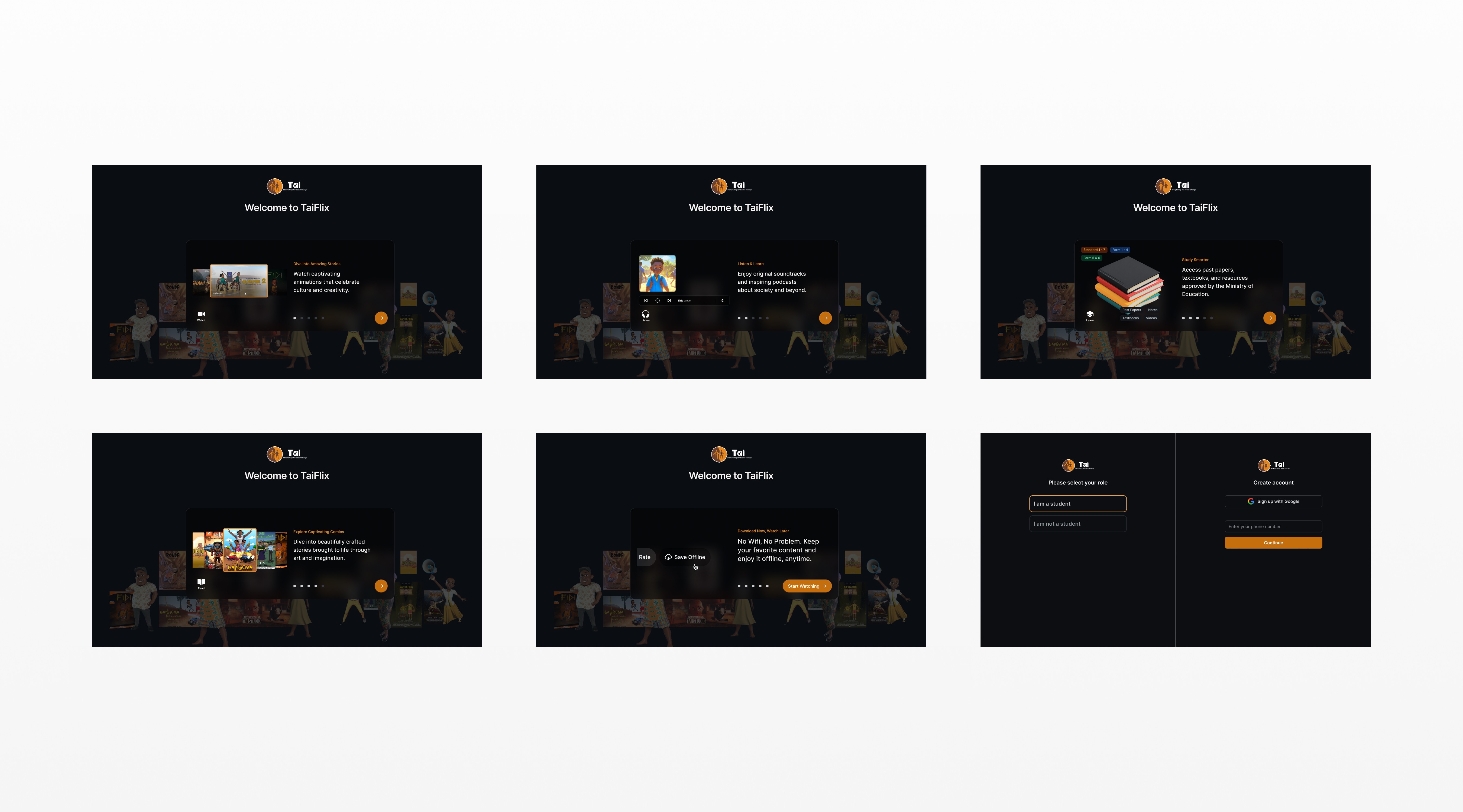
Onboarding & auth
Registration, login, social sign-in, forgot password
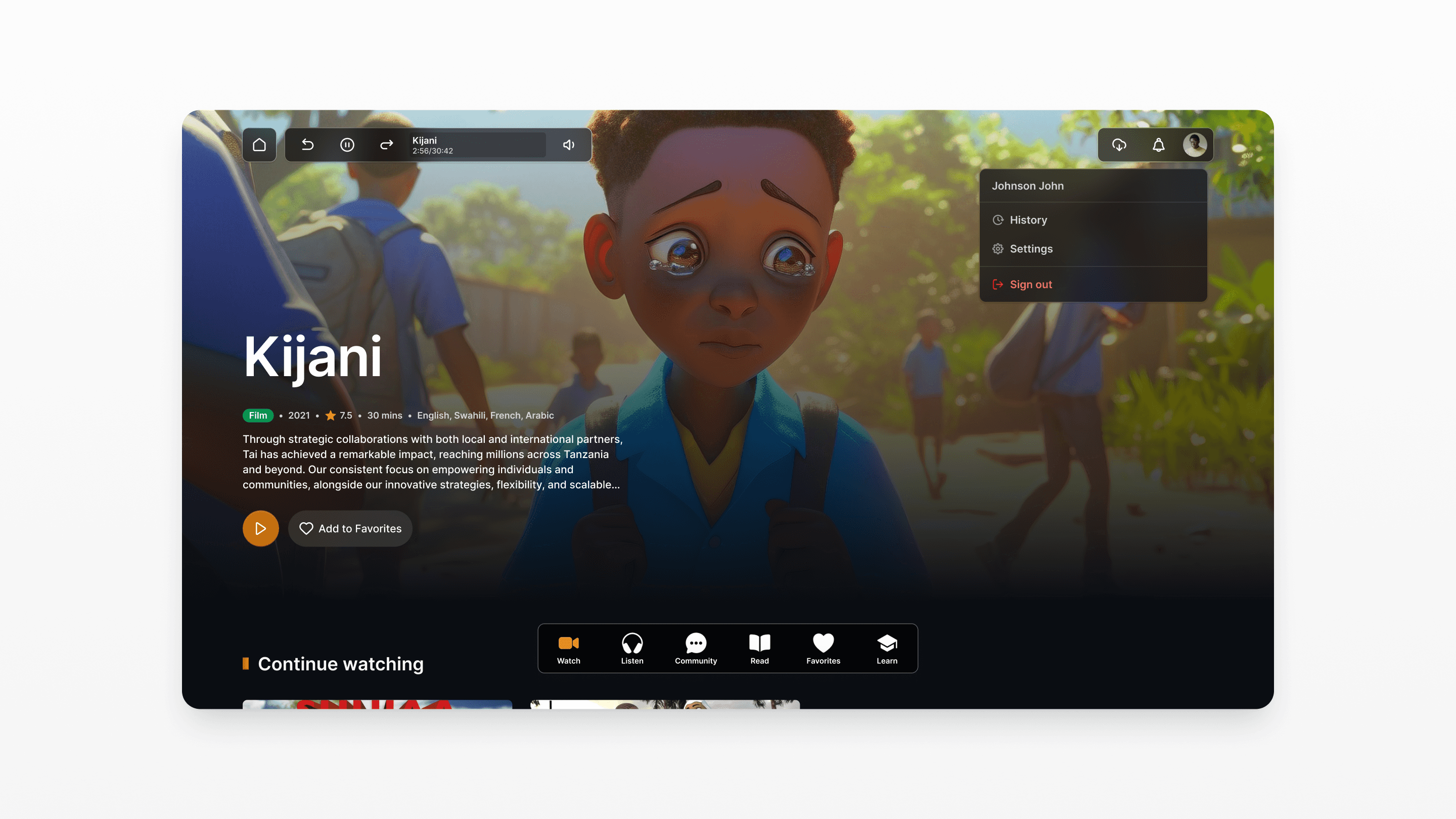
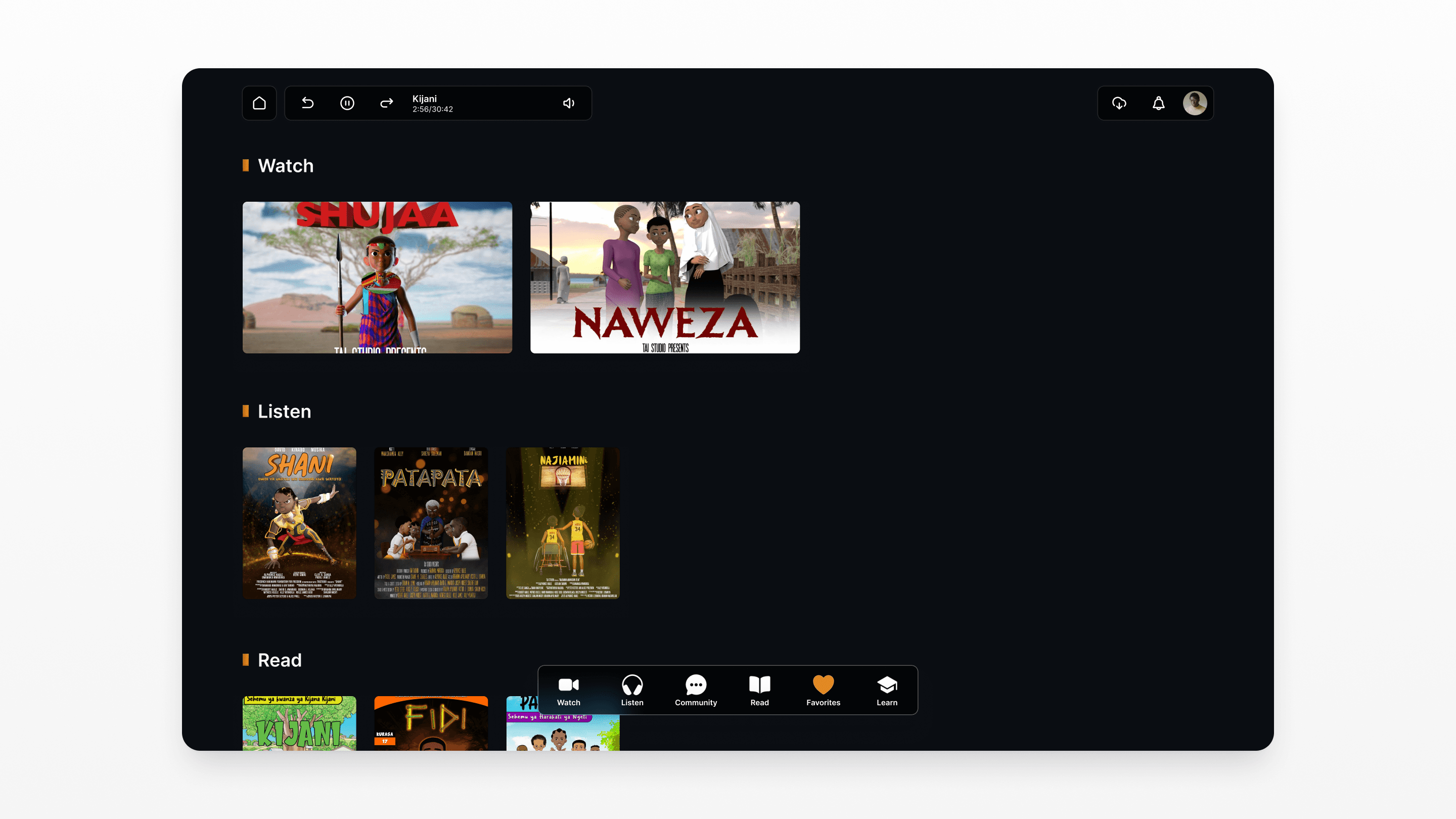
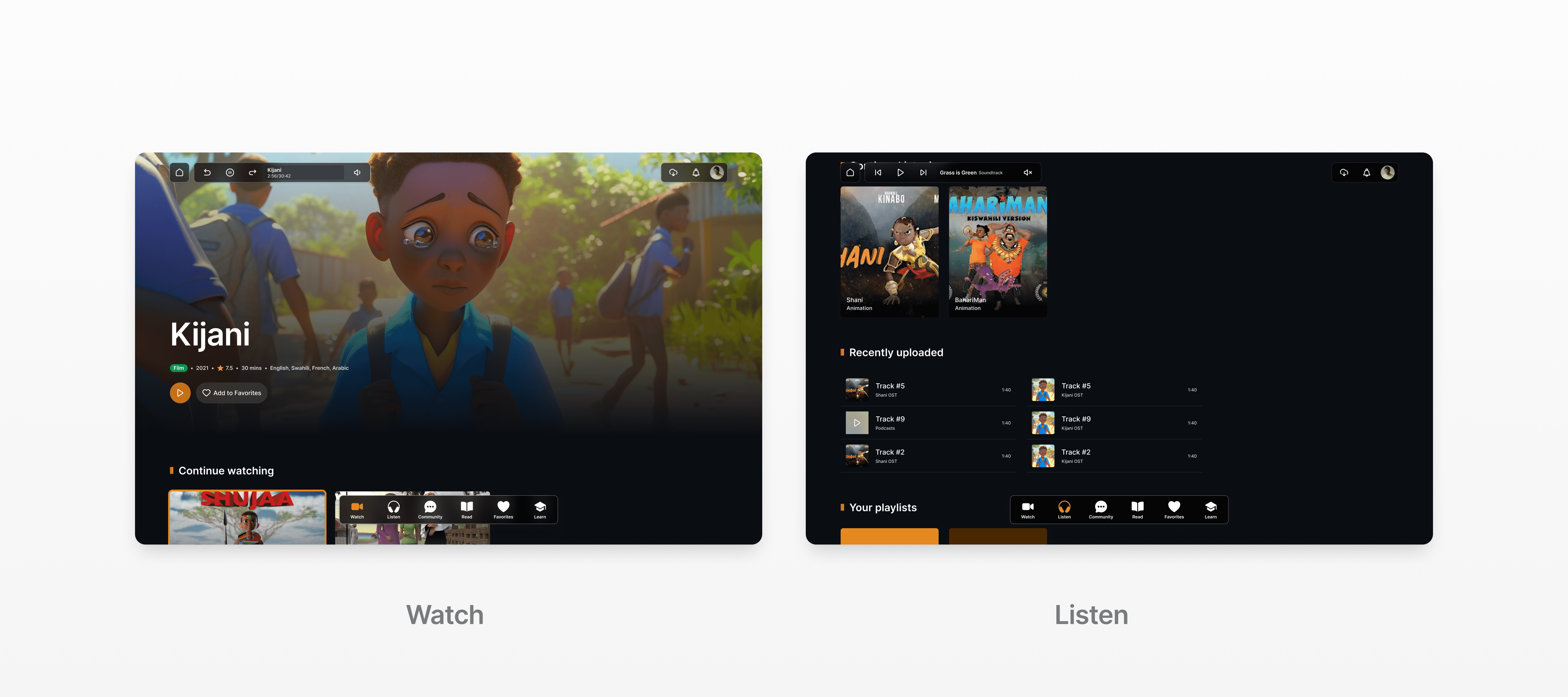
Home (Watch)
Browse, recommendations, search, filter, video detail
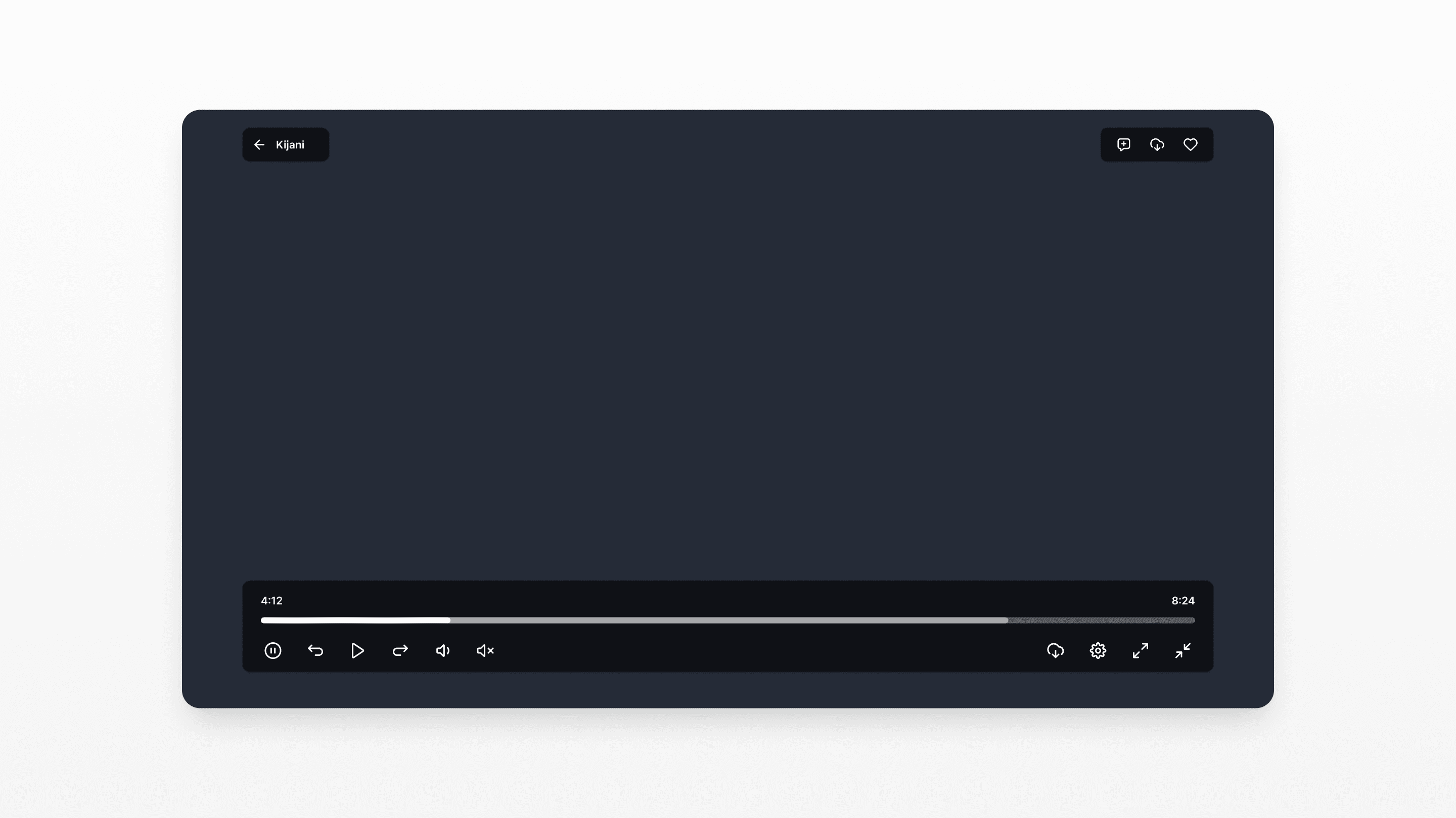
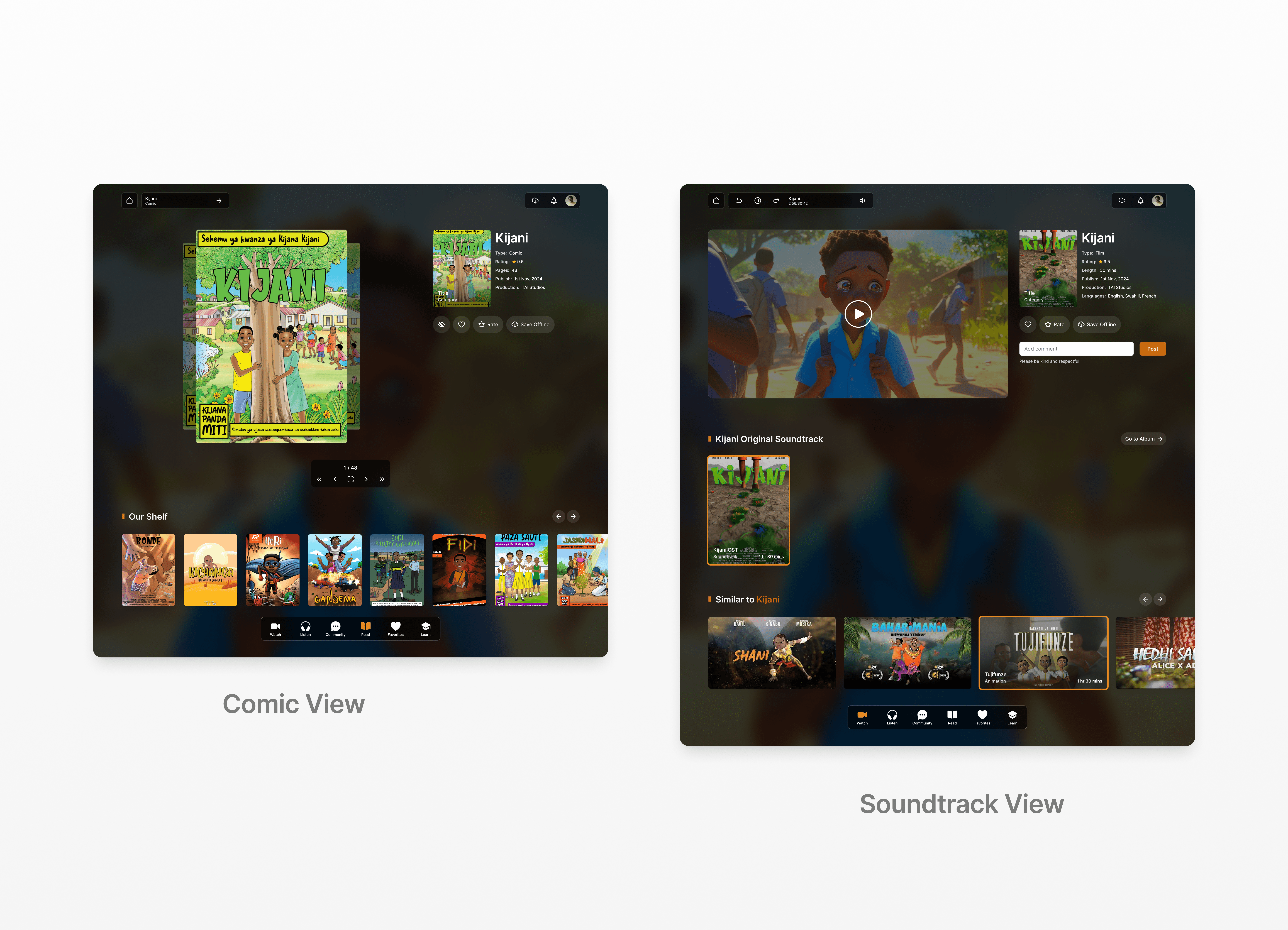
Video player
Fullscreen, quality toggle, comments, related content
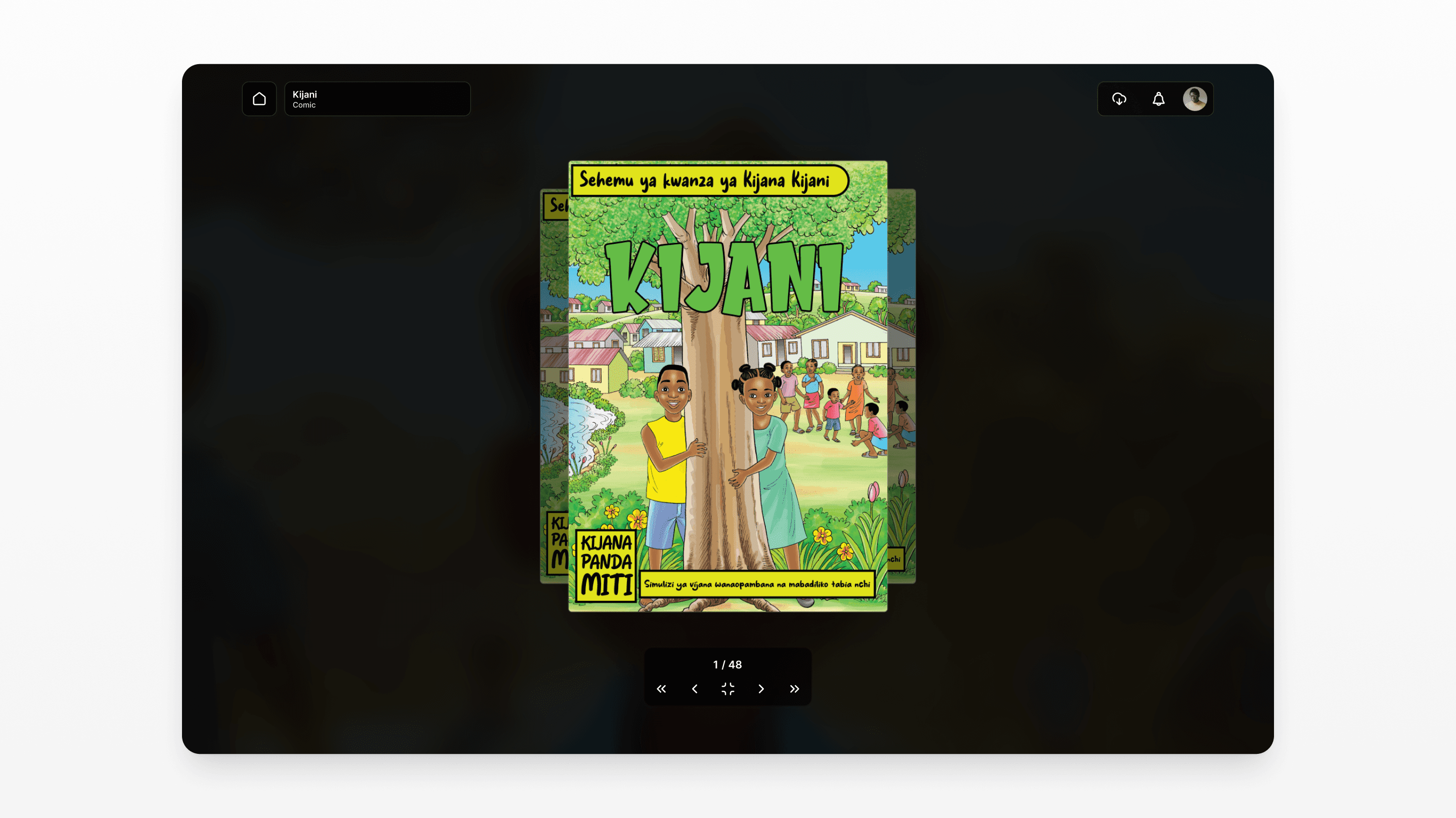
Comic reader
Page navigation, zoom, selection mode, offline reading
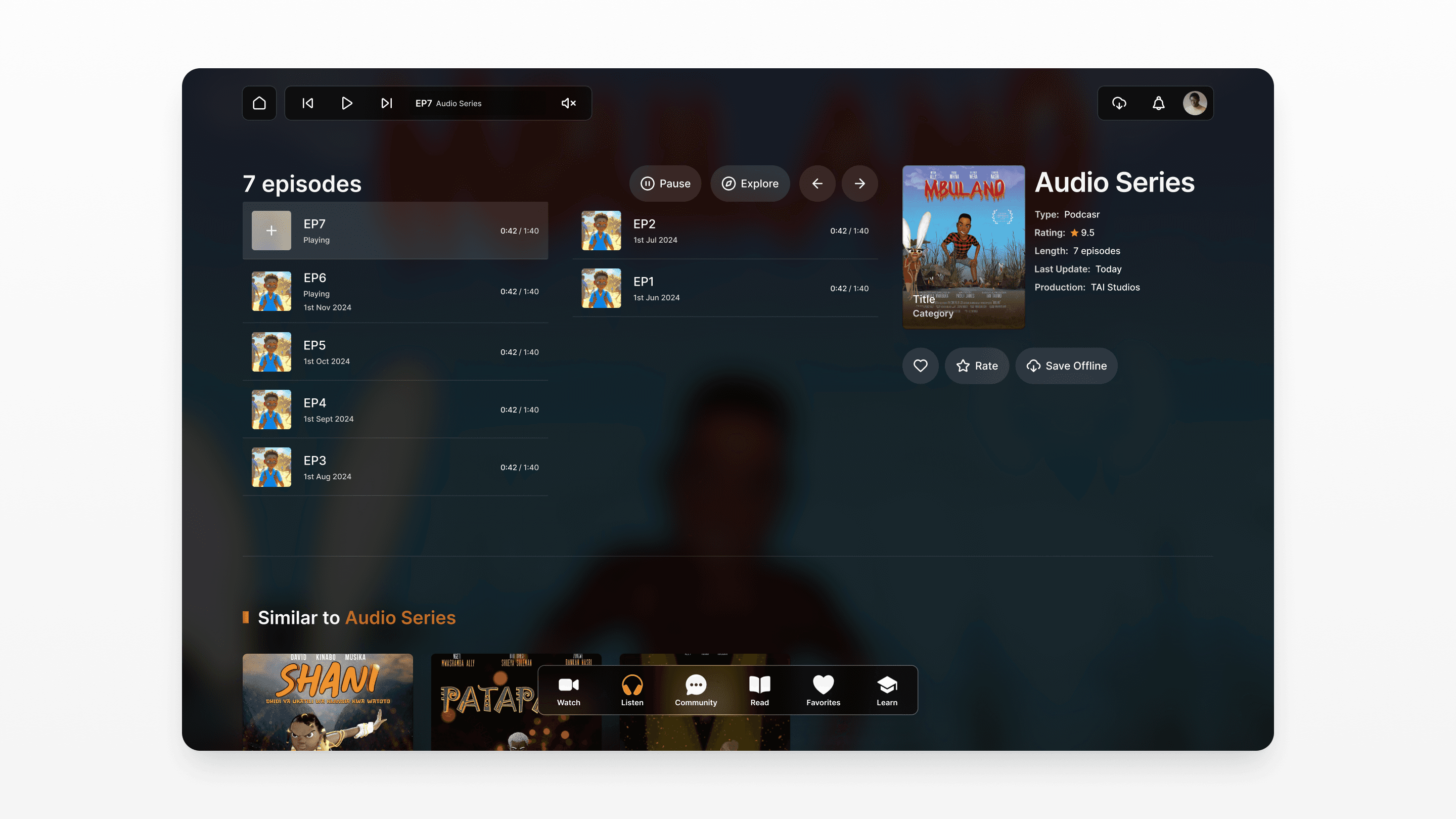
Audio player
Play/pause, instant play from list, stories/music/podcasts
Favorites
Saved content hub, remove, quick access
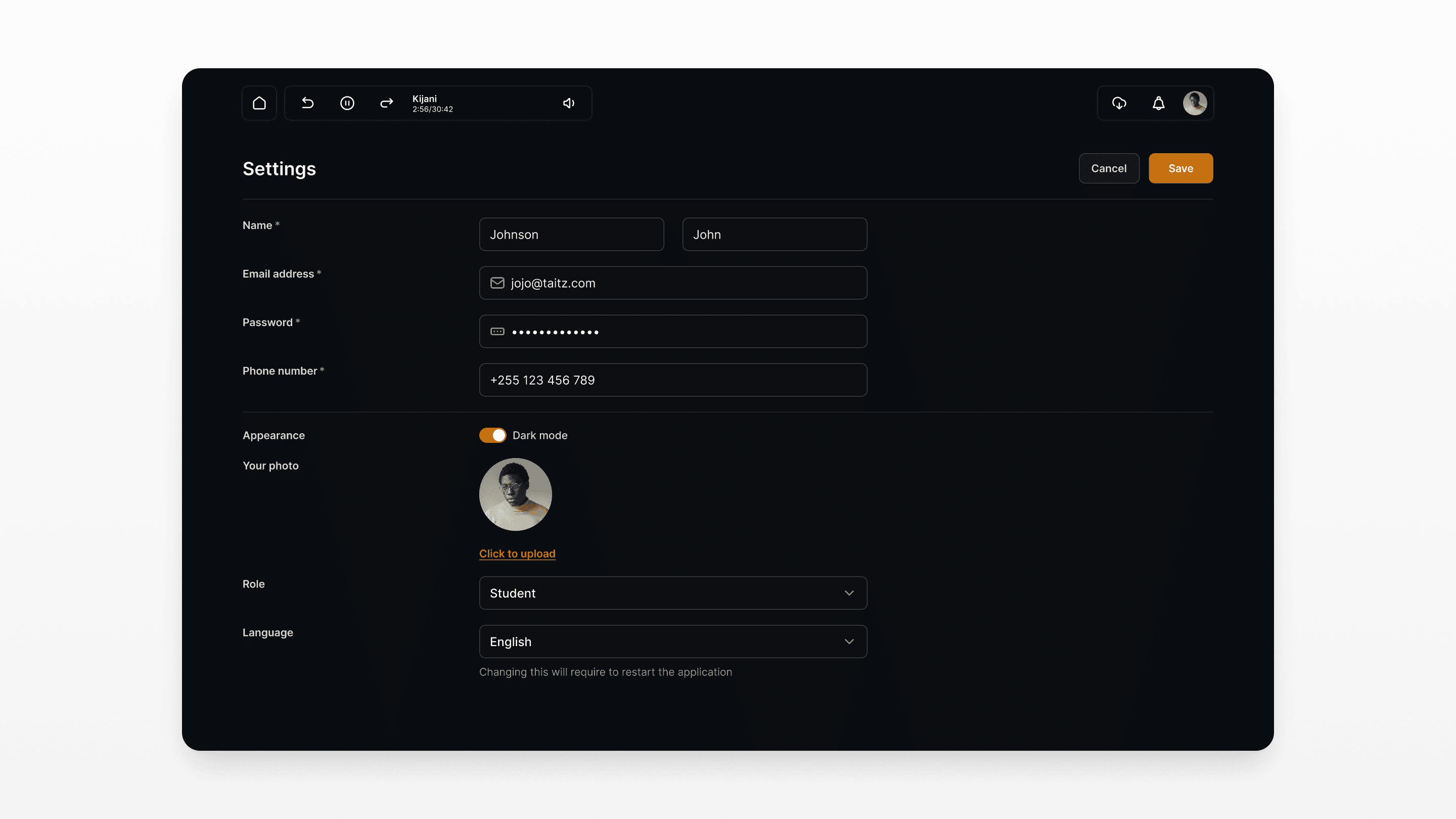
Settings & profile
Personal info, account management, offline downloads
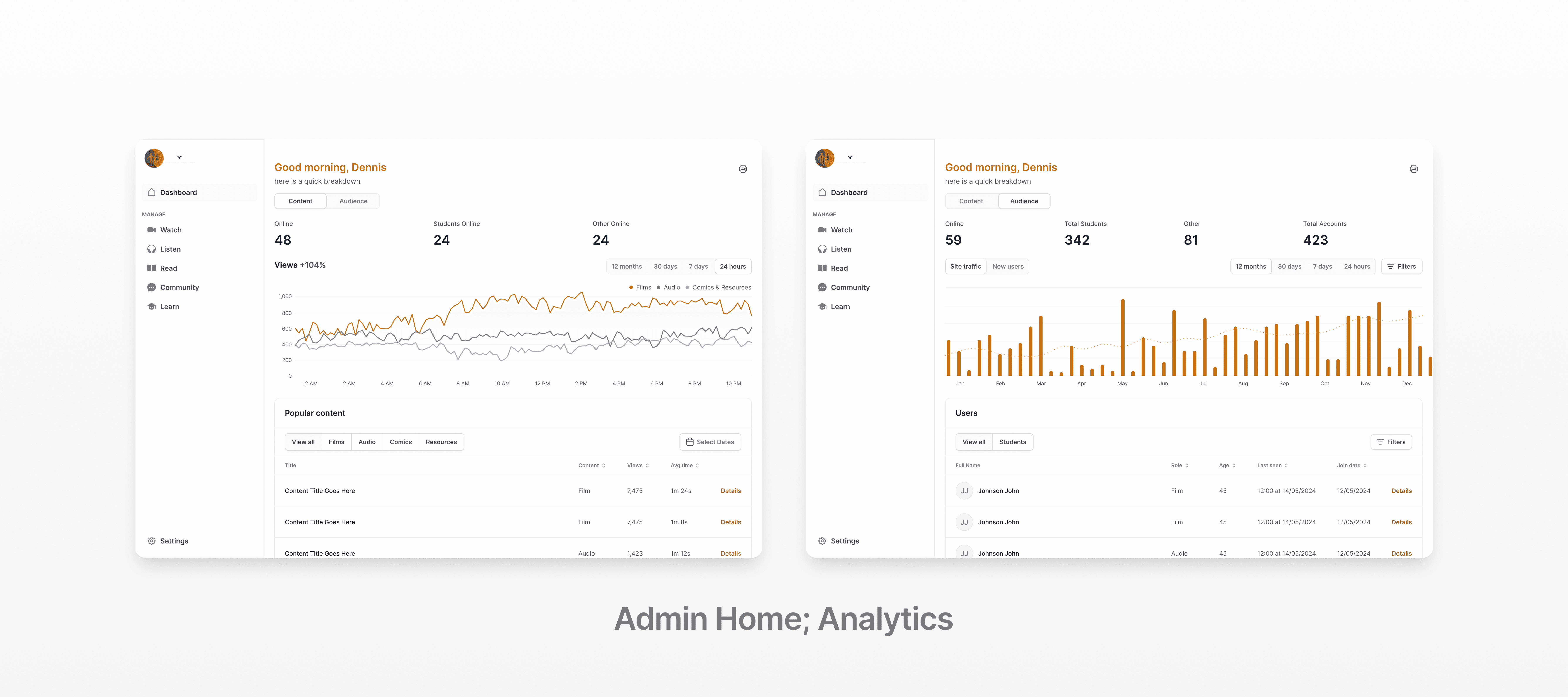
Admin Panel:
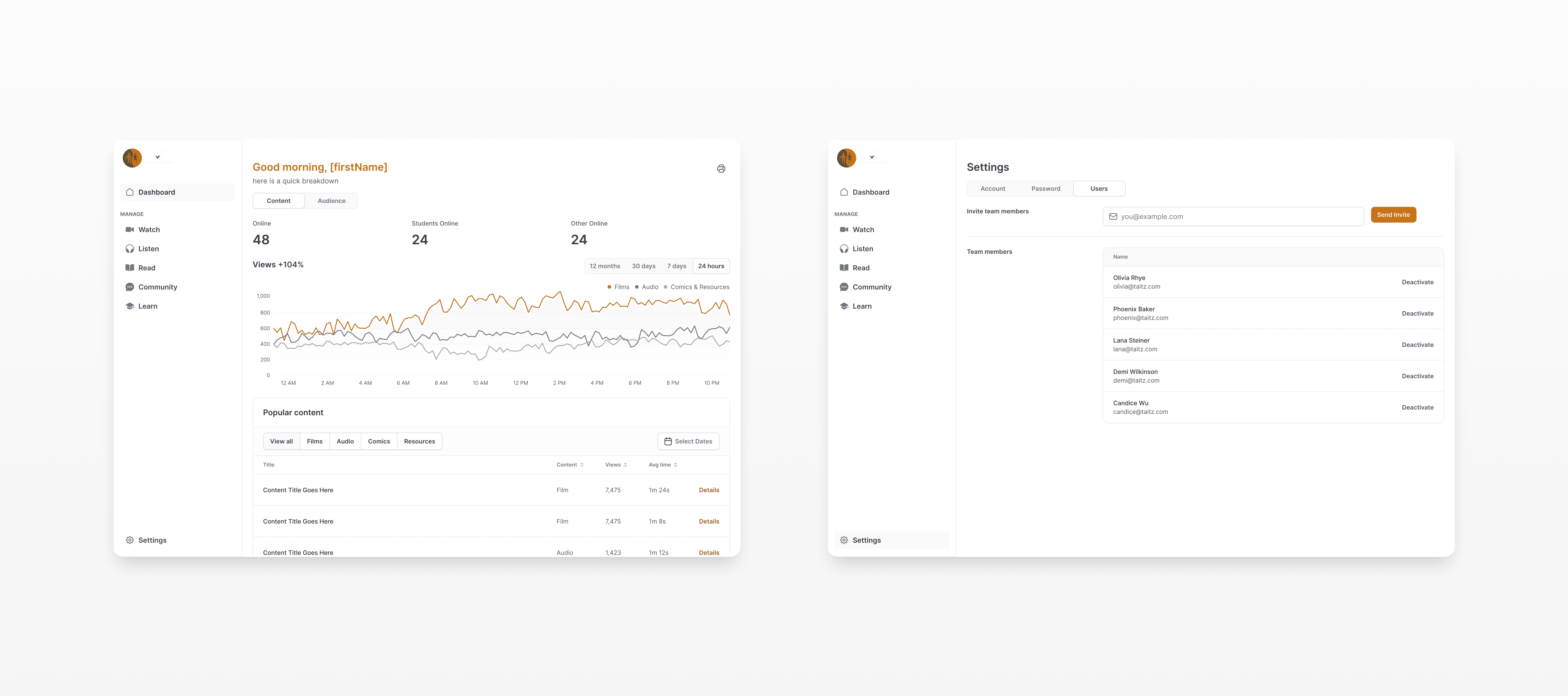
Dashboard
Insights, statistics, most-loved content
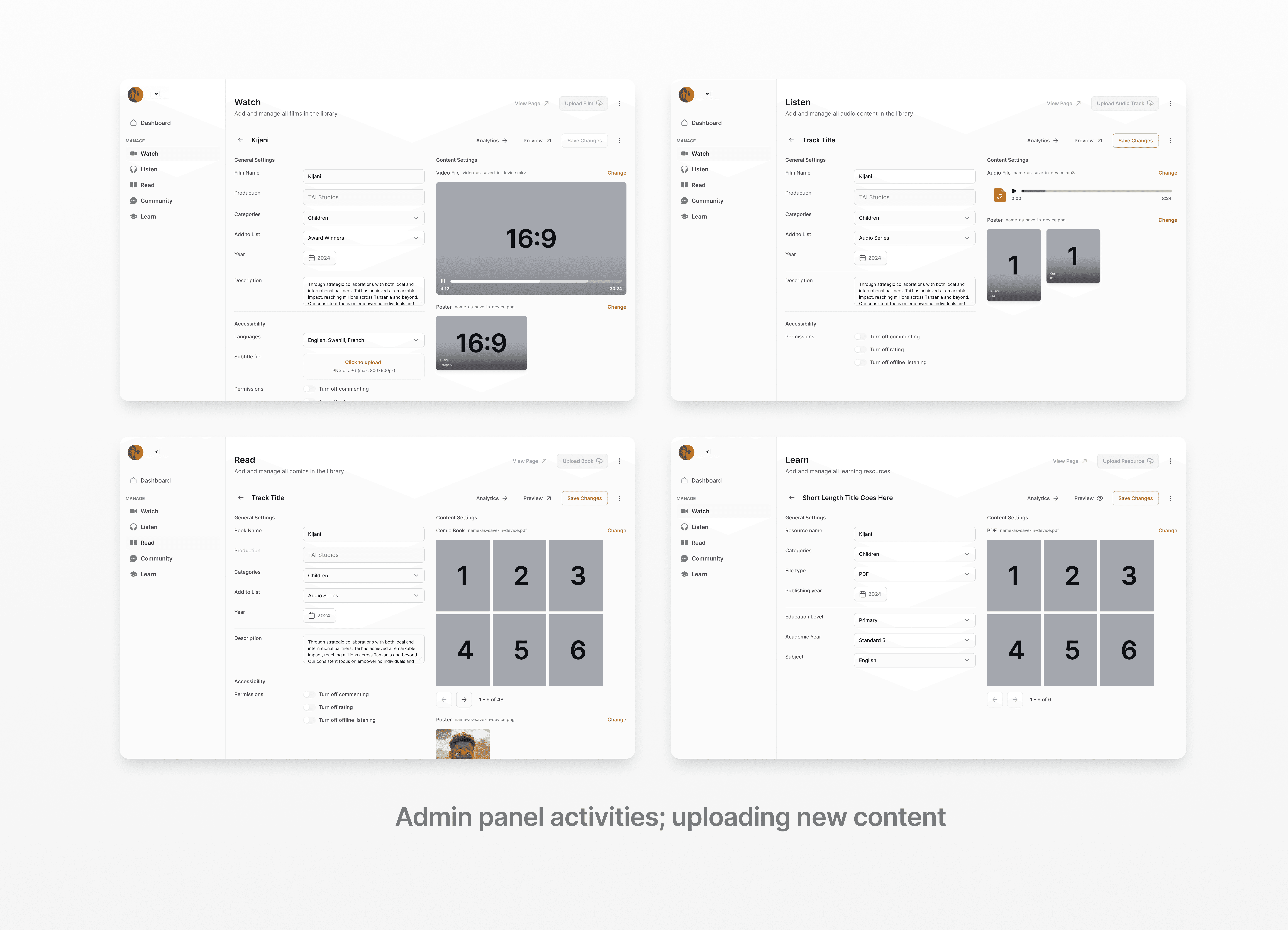
Content types
Set, edit, delete content categories system-wide
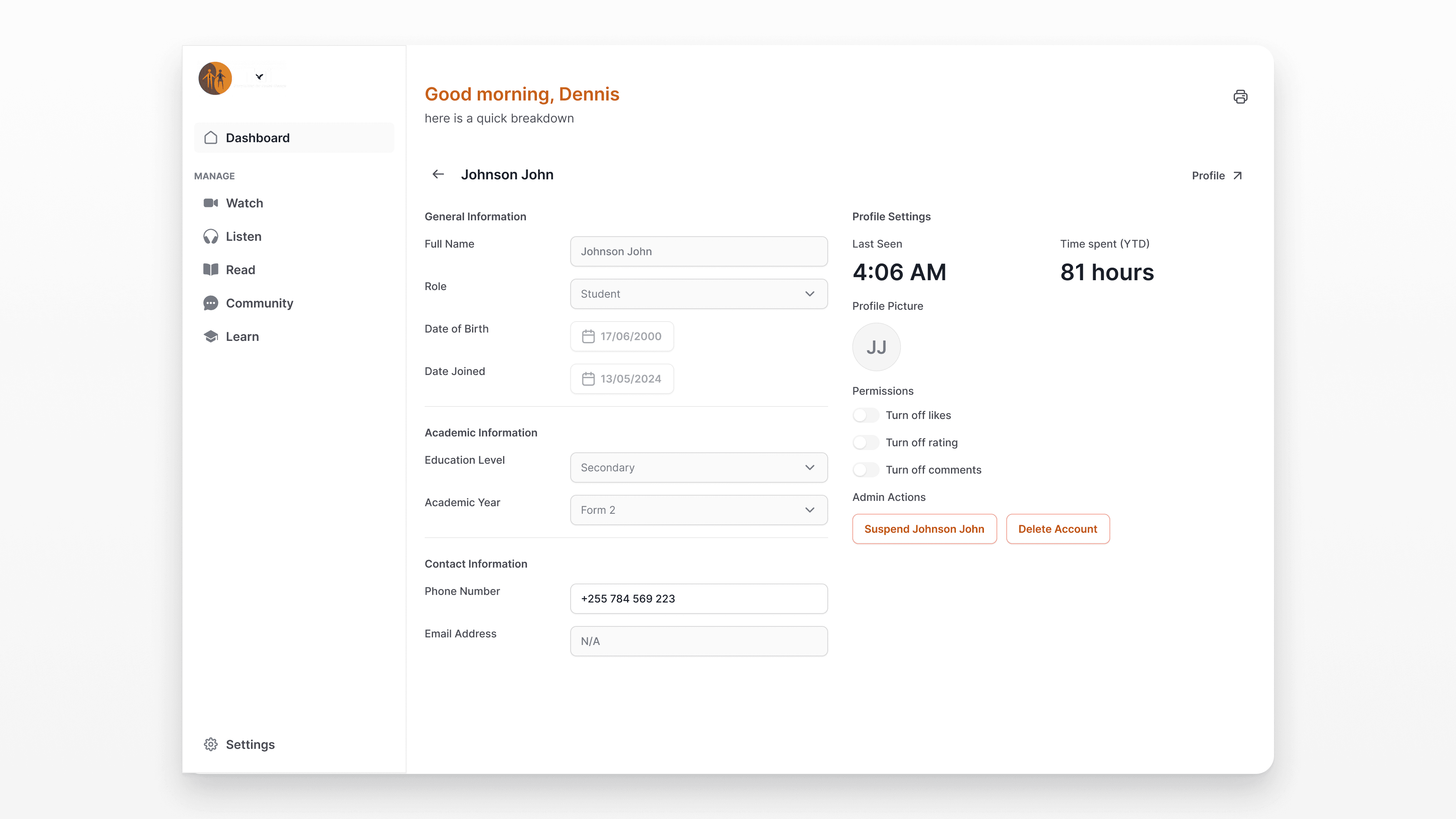
User accounts
Monitor, activate/deactivate, role assignment
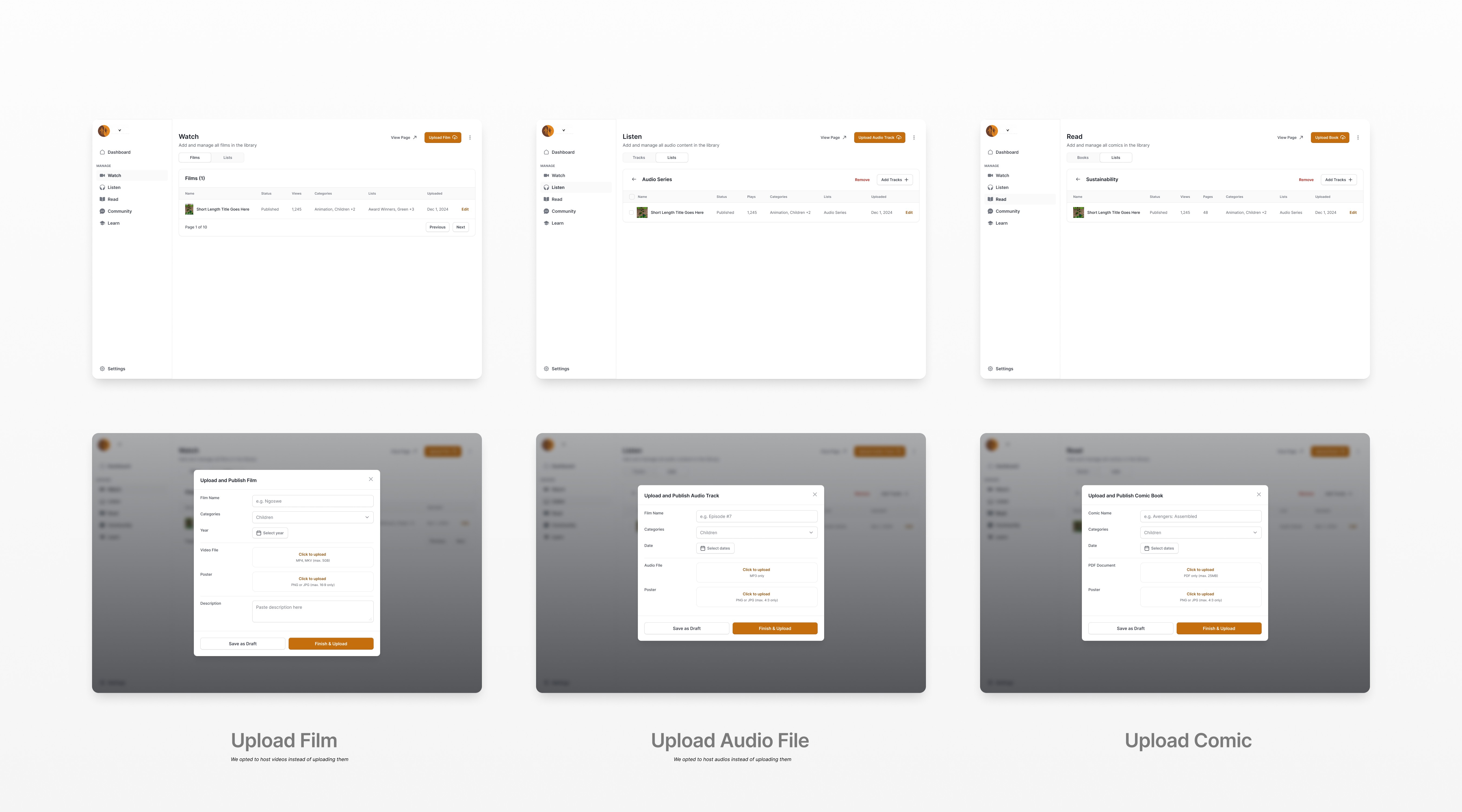
Animation, Audio, Comic CMS
Upload animations, audio, comics by category
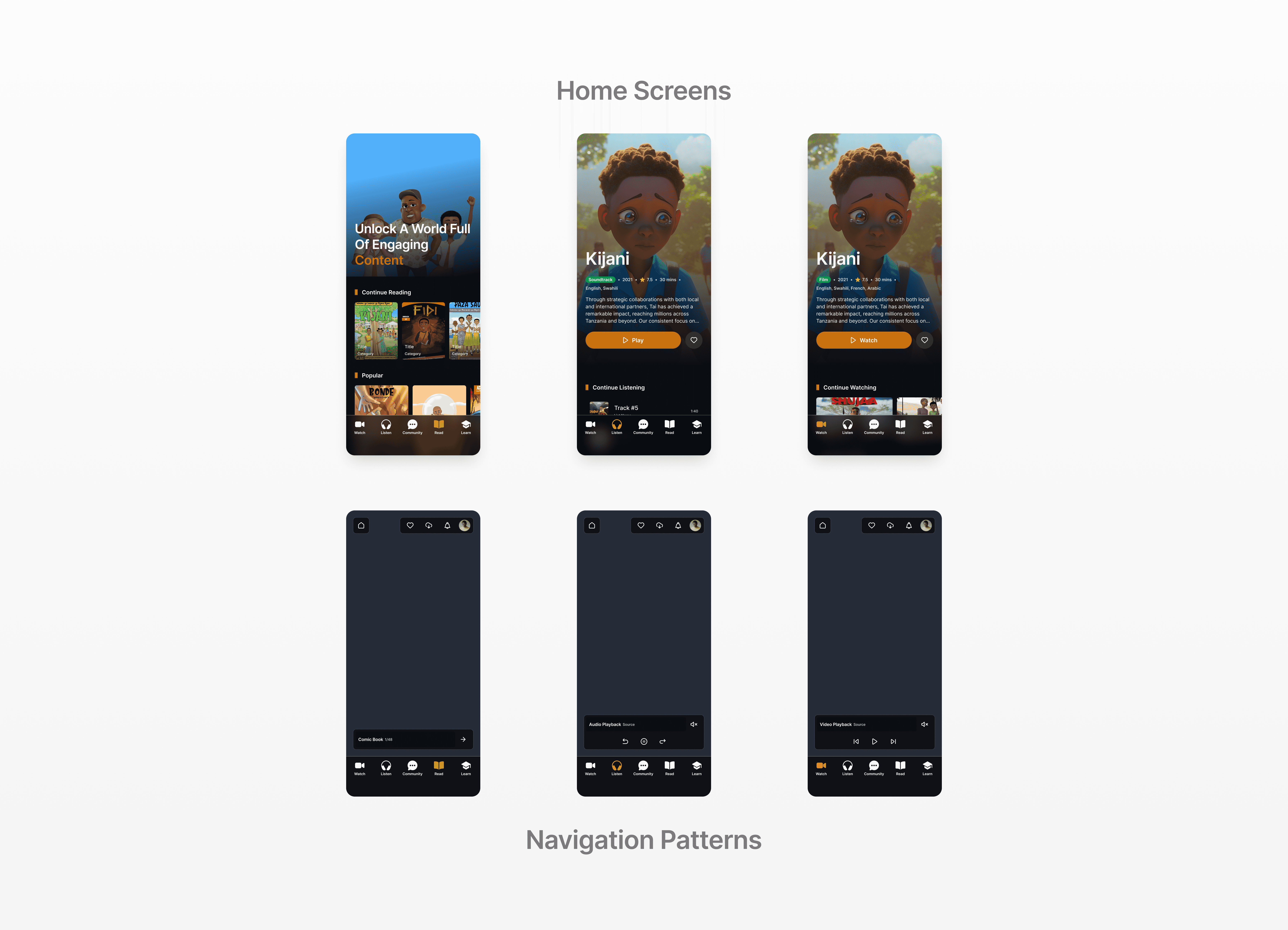
Navigation built around what users do
Rather than organizing by content type in abstract categories, TaiFlix's navigation is built around verbs what the user wants to do right now. Five primary modes, one bottom nav.
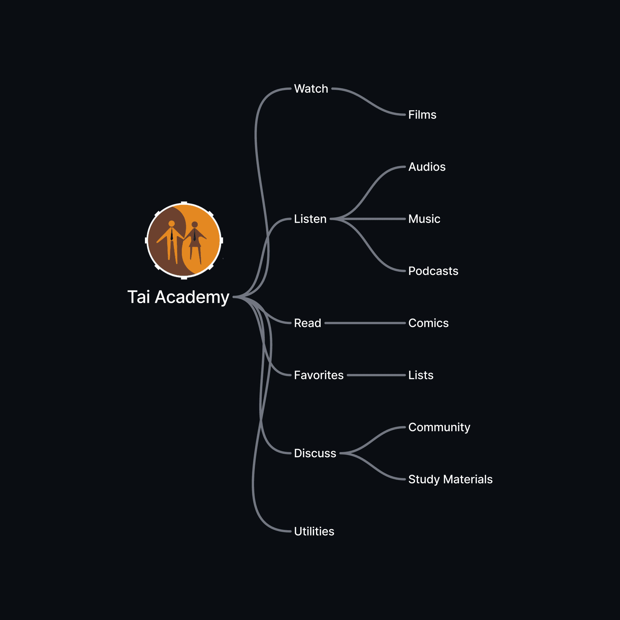
The Listen tab consolidates three audio formats (audio stories, music, podcasts) into a single section with sub-tabs reducing top-level nav clutter while keeping each format discoverable.
This was a deliberate IA (Information Architecture) choice: most users arrive with a mood, not a format in mind.
Choices that shaped the experience
Verb-first navigation over content-type tabs
Organizing around Watch / Listen / Read mirrors how users think about their evening — not how a product manager categorizes a library. This reduced decision paralysis and made the app feel more like a companion than a catalogue.
Instant play from list no forced detail page for audio
For audio content (music, podcasts), users can tap and play immediately from the browse screen without navigating to a detail page first. Detail pages are still accessible but not mandatory reducing friction for passive listening.
Admin as a separate product, not a screen
The React-based admin panel was treated as a distinct product with its own design system. Mixing admin controls into the consumer app would compromise both experiences so the admin panel got its own IA, flows, and component logic.
What this project taught me
TaiFlix was a lesson in designing for constraint, not against it. Unstable internet, limited storage, and diverse device capabilities aren't edge cases in the Tanzanian market they are the primary use case.
Every design decision had to start with: does this work offline? Can this load gracefully on a slower connection? That shifted my thinking away from feature-richness toward functional resilience.
Designing five different playback paradigms video, audio, comics, podcasts, and music within one visual language was the hardest UX puzzle. The temptation is to let each format look like a separate app. The challenge is to make them all feel like the same product.
I solved this by leaning on consistent card patterns, a shared interaction grammar (tap to preview, swipe to queue, long-press to save), and keeping the navigation anchored in verb modes rather than content types.
Working within a three-week timeline also sharpened my prioritization instincts. That discipline knowing when good is enough and when something needs another iteration is one of the most practical skills I took away from this project.
More