BACK
Calaura
Calaura
Designing a pantry-first wellness experience
Calaura is a mobile wellness app designed to help users make better nutrition decisions based on what they already have.
My Role | Duration | Platforms | Status | Client |
UX/UI Designer | 3 Weeks | Mobile | MVP | Andre Mgowano |
It combines:
health data (BMI, calorie needs)
user goals (lose, maintain, gain)
real pantry inputs
The goal is to generate practical, personalized meal suggestions
Problem
Most wellness apps fail in one key way:
They provide ideal plans, not real-life solutions.
Users struggle with:
decision fatigue (“what should I eat?”)
lack of personalization
disconnect between plans and actual pantry items
Result: low consistency, high drop-off.
Goal
Design a system that:
reduces daily decision-making
adapts to real user context (available food)
guides users toward consistent, achievable habits
Core Insight
Users don’t need more information.
They need clear, immediate decisions.
Design Approach
We structured the experience around one principle:
Start with what the user already has.
This led to a pantry-first flow, supported by health data.
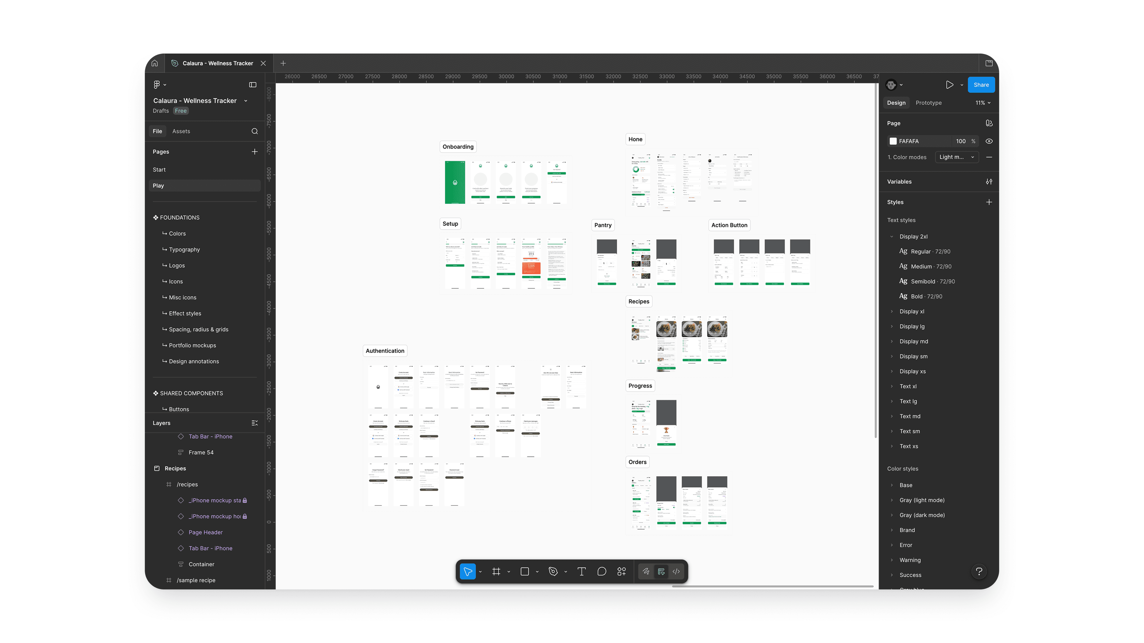
Key User Flow
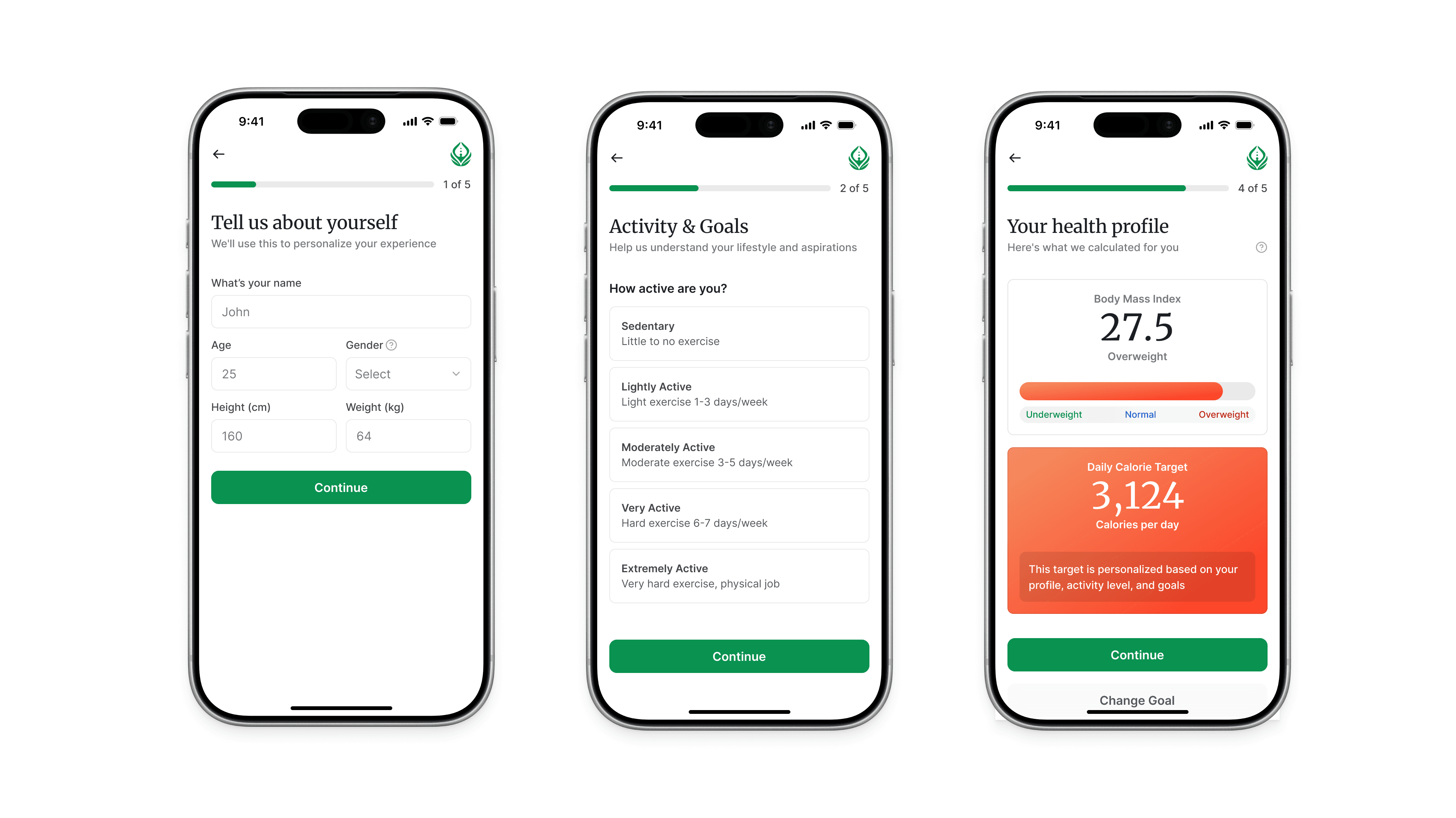
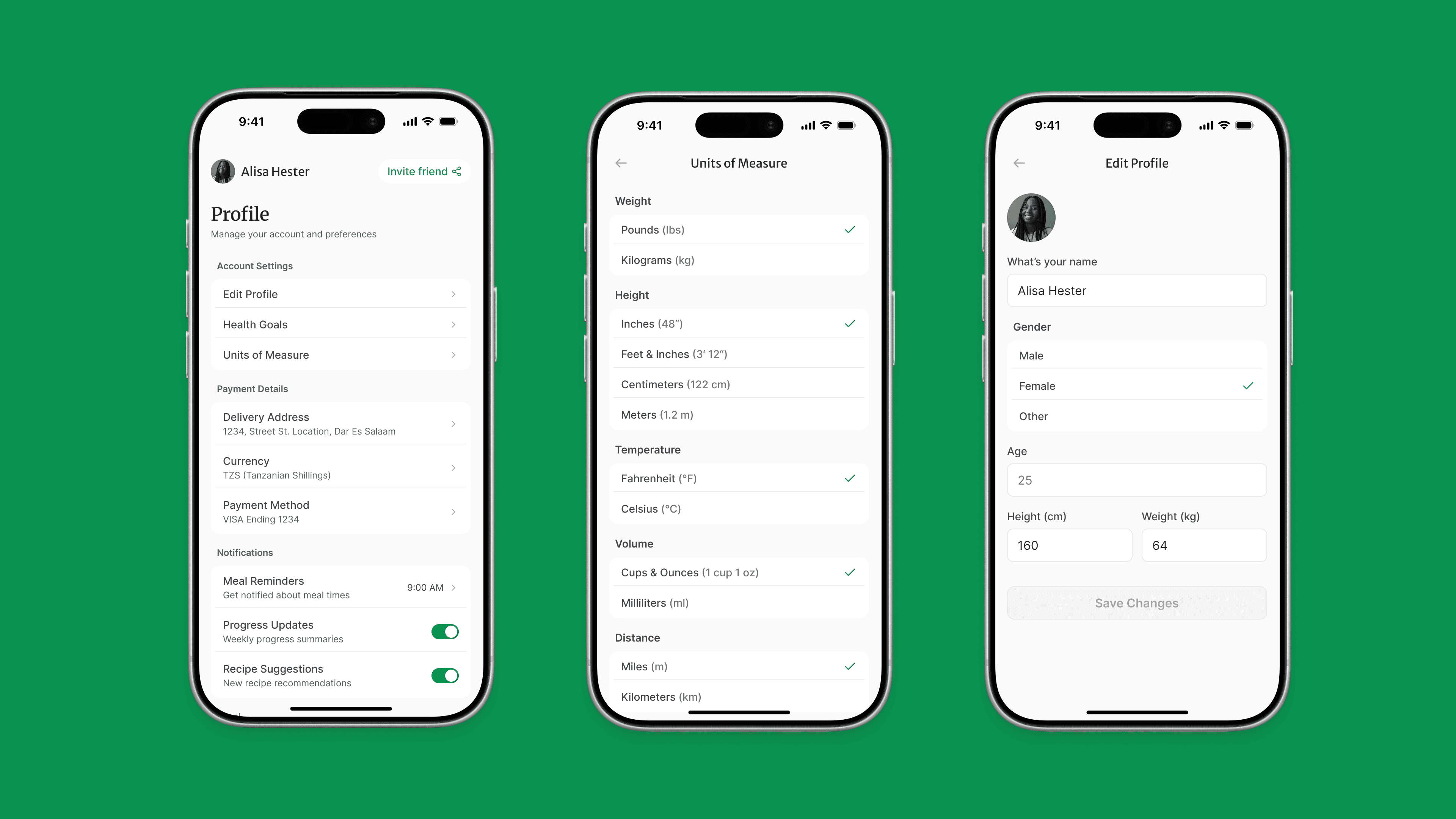
1. Onboarding & Profile Setup
Objective: capture essential data with minimal friction
Inputs: age, weight, height, gender
Activity level selection
Goal selection (lose / maintain / gain)
UX Decisions:
Progressive disclosure (step-by-step instead of long form)
Visual sliders for goals → faster input
Clear progress indicator → reduces drop-off
2. BMI & Calorie Feedback
Objective: provide immediate value
Visual BMI scale (easy to interpret)
Daily calorie recommendation
Clear CTA = “Go to Pantry”
UX Decisions:
Visual over numeric complexity
Immediate feedback loop = builds trust early
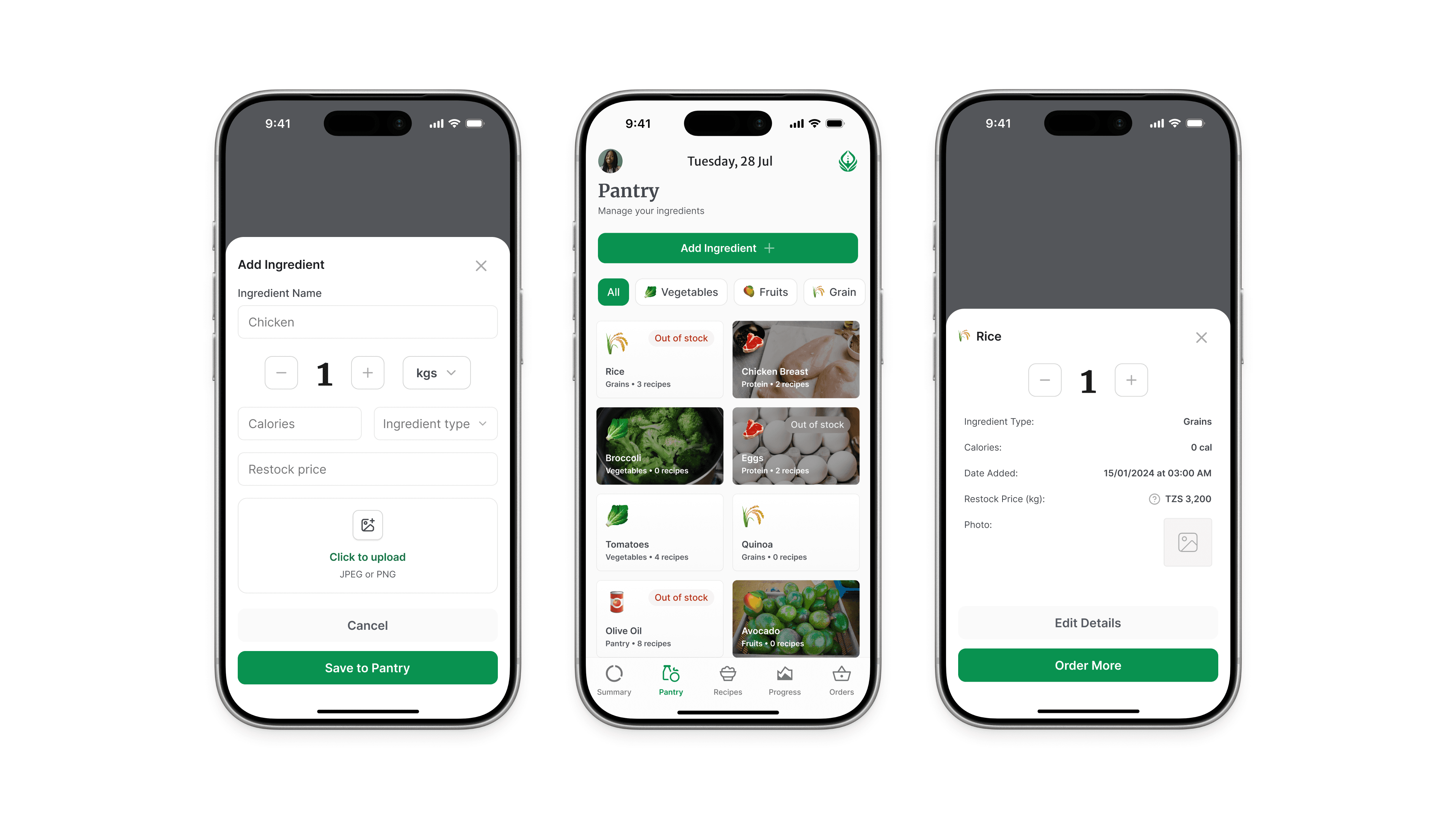
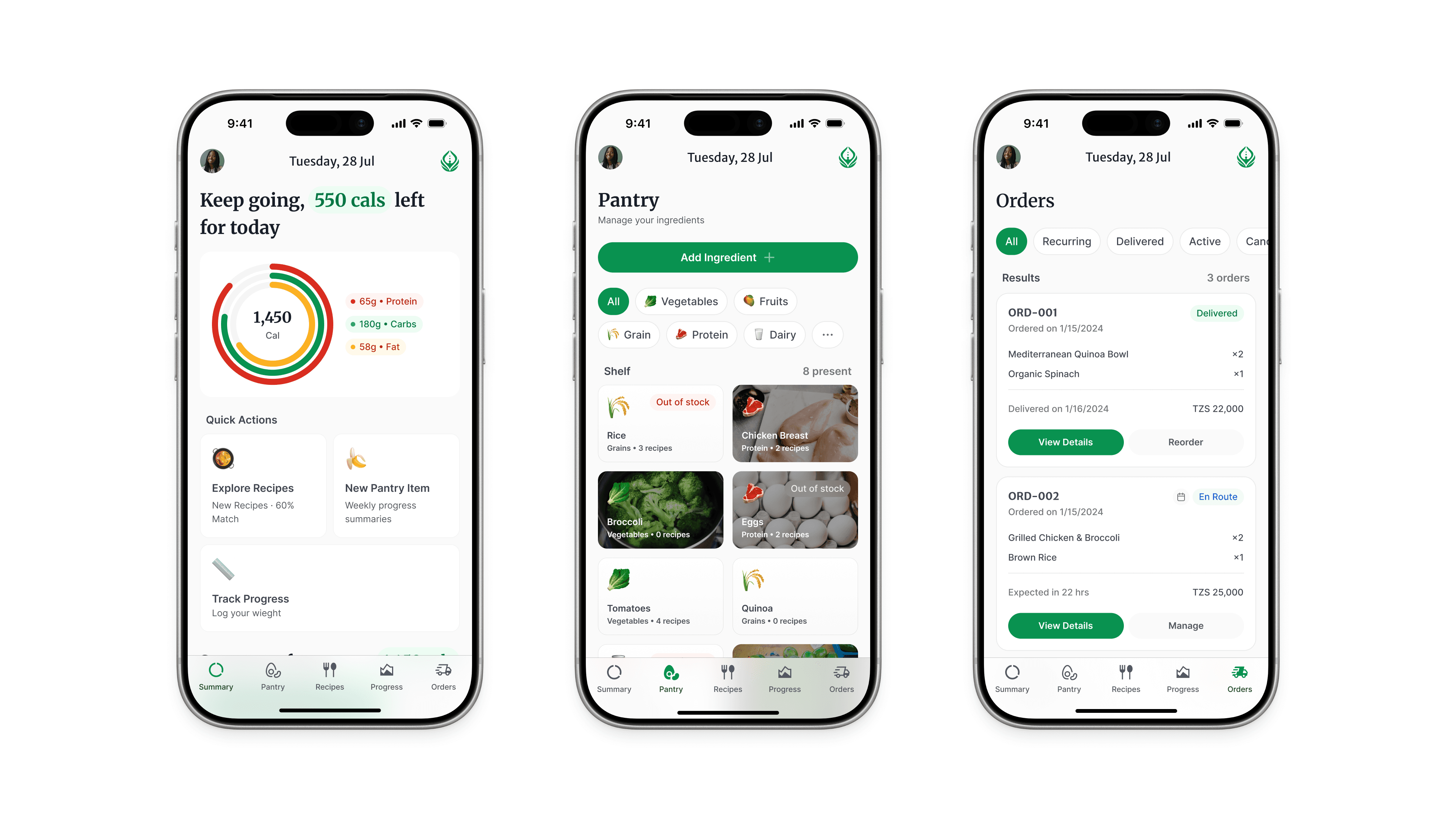
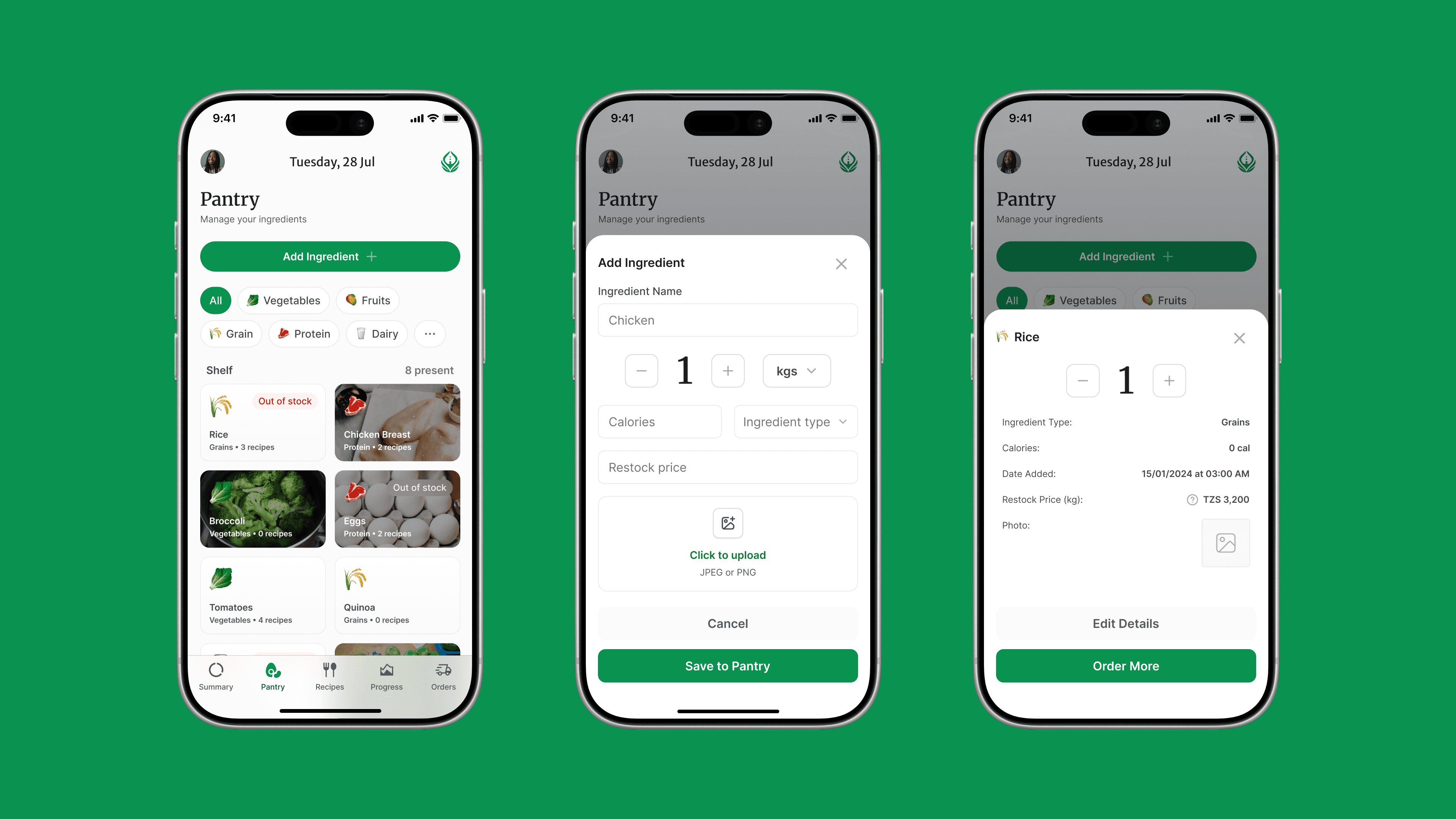
3. Pantry Management
Objective: anchor the system in real-life context
Categorized inputs (vegetables, grains, etc.)
Add / edit / delete items
Tag frequent/staple foods
UX Decisions:
Chip-based inputs = quick scanning
Category grouping = reduces cognitive load
Editable system = flexible, not rigid
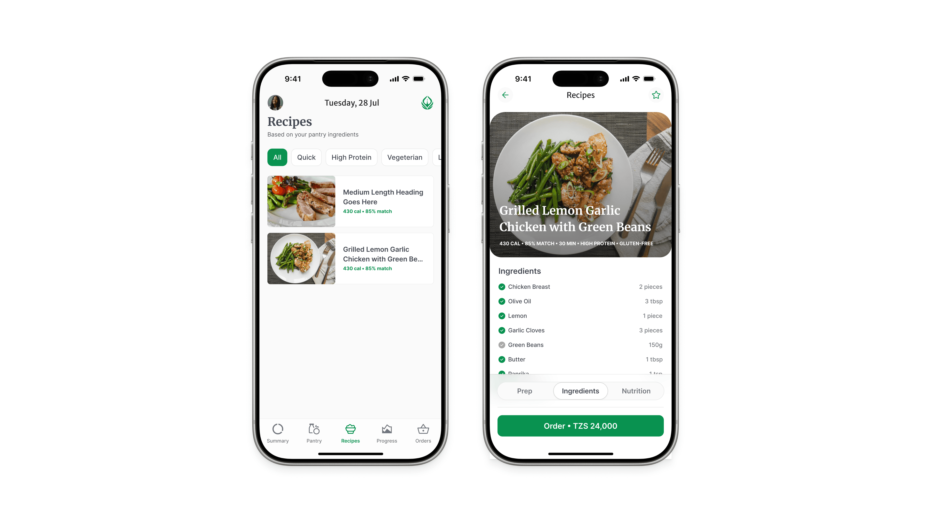
4. Recipe Suggestions
Objective: turn data into action
Personalized recipe cards
Pantry match %
Filters (quick, high-protein, etc.)
UX Decisions:
Match % creates instant relevance
Card layout = easy browsing
Clear CTA: “View Recipe”
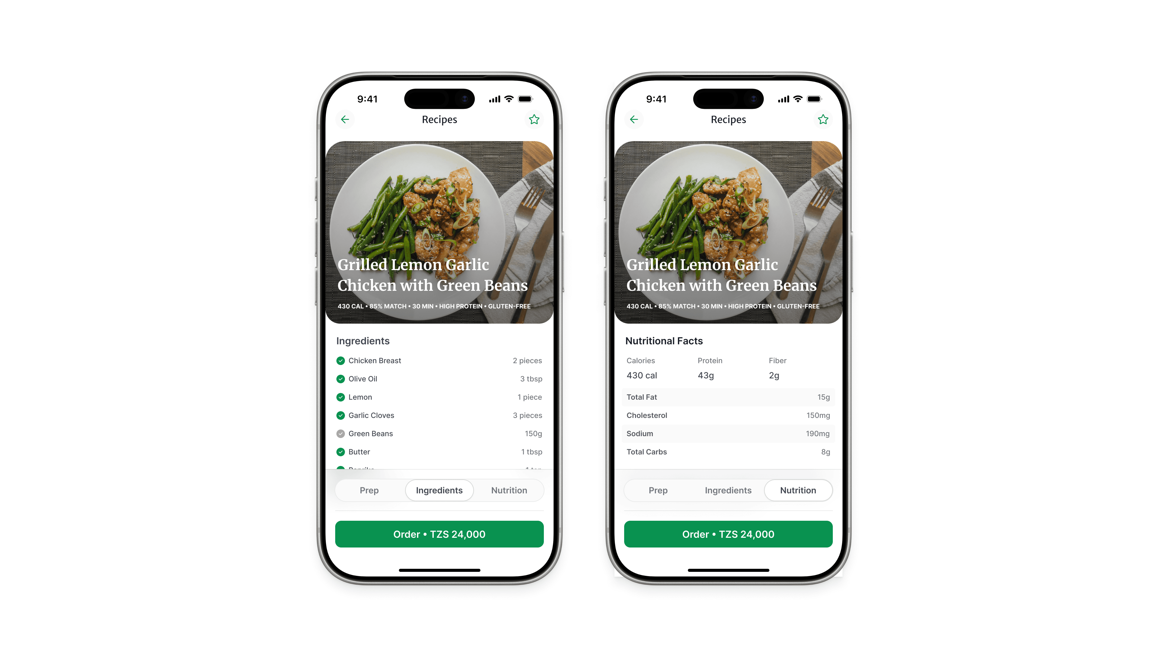
5. Recipe Detail
Objective: support execution
Ingredients + instructions
Nutrition breakdown
Pantry alignment
UX Decisions:
Clean hierarchy (ingredients > steps > nutrition)
Action-focused CTA: “Add to Daily Plan”
6. Daily Dashboard
Objective: create clarity and consistency
Meals overview
Calorie budget
Quick navigation
UX Decisions:
One-screen summary = reduces overwhelm
Motivational microcopy = reinforces habit
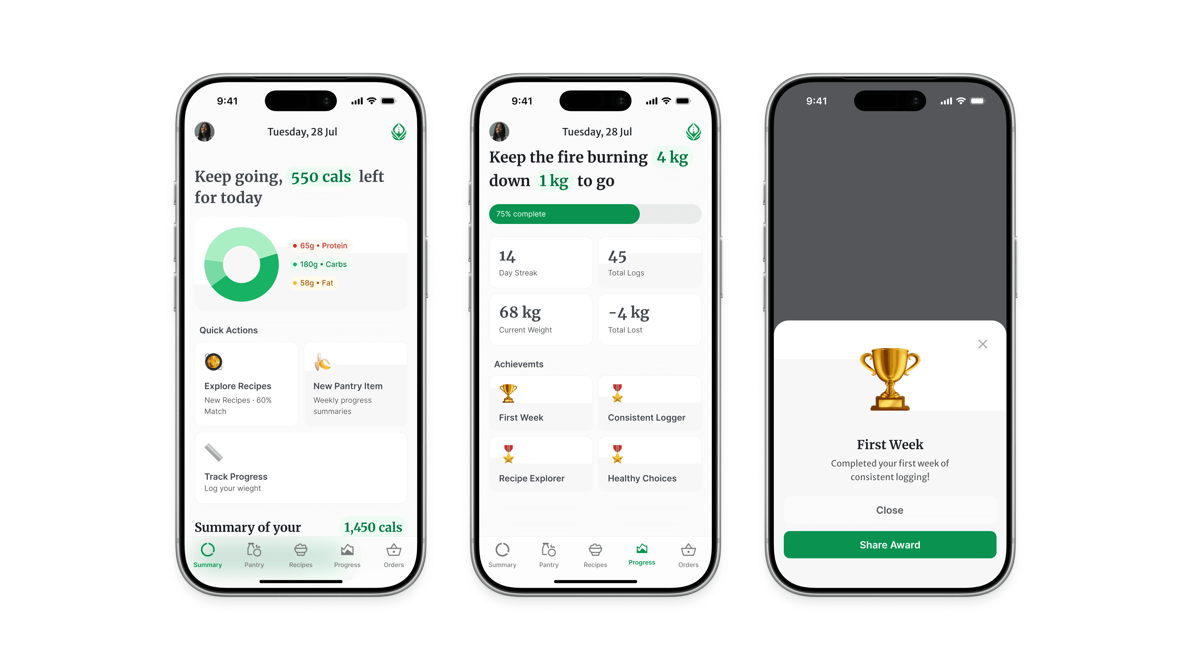
7. Progress Tracking
Objective: reinforce long-term behavior
Weight/BMI graph
Streaks and badges
Quick weight update
UX Decisions:
Visual progress = emotional reinforcement
Small wins (streaks) = habit formation
What Makes Calaura Different
Most apps ask:
“What should you eat?”
Calaura asks:
“What do you already have?”
Reflection
Designing Calaura highlighted a key lesson:
The best UX doesn’t simplify the system.
It simplifies the user’s next decision.
More