BACK
FursaHub
FursaHub
Designing a unified platform where opportunity meets access connecting admins, organizations, and clients across jobs, funding, courses, and a peer marketplace.
My Role | Duration | Platforms | Status |
UX/UI Designer | 7 Weeks | Mobile, Web | MVP |
What is FursaHub?
FursaHub is a multi-sided platform designed to democratize access to opportunity.
It connects three distinct user types Admins who govern the platform, Organizations who publish opportunities, and Clients who both seek those opportunities and can run their own micro-businesses through an integrated marketplace.
The challenge was to design a single cohesive product that serves radically different goals without fragmenting the experience.
Four design problems, one platform
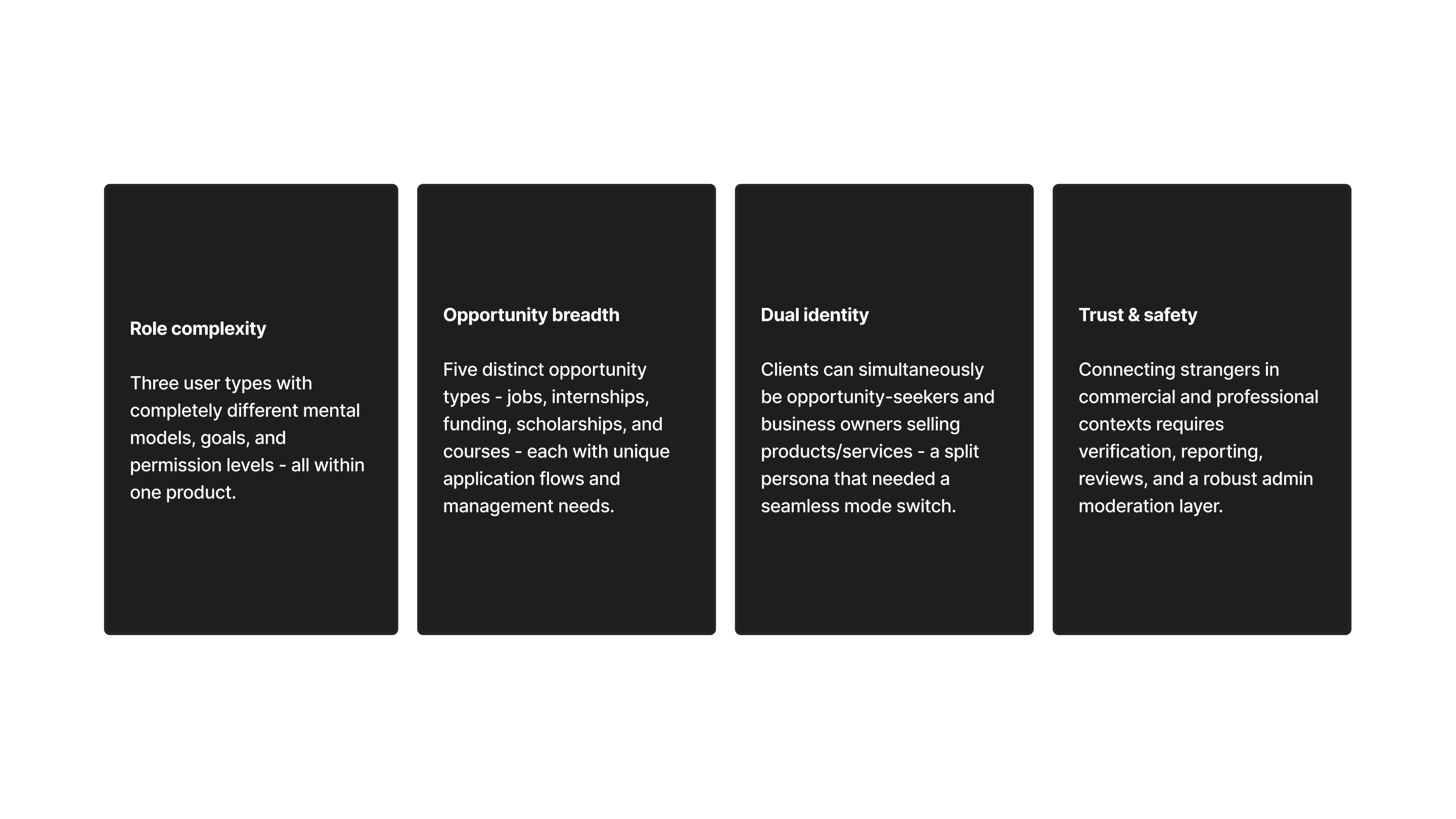
Understanding who we're designing for
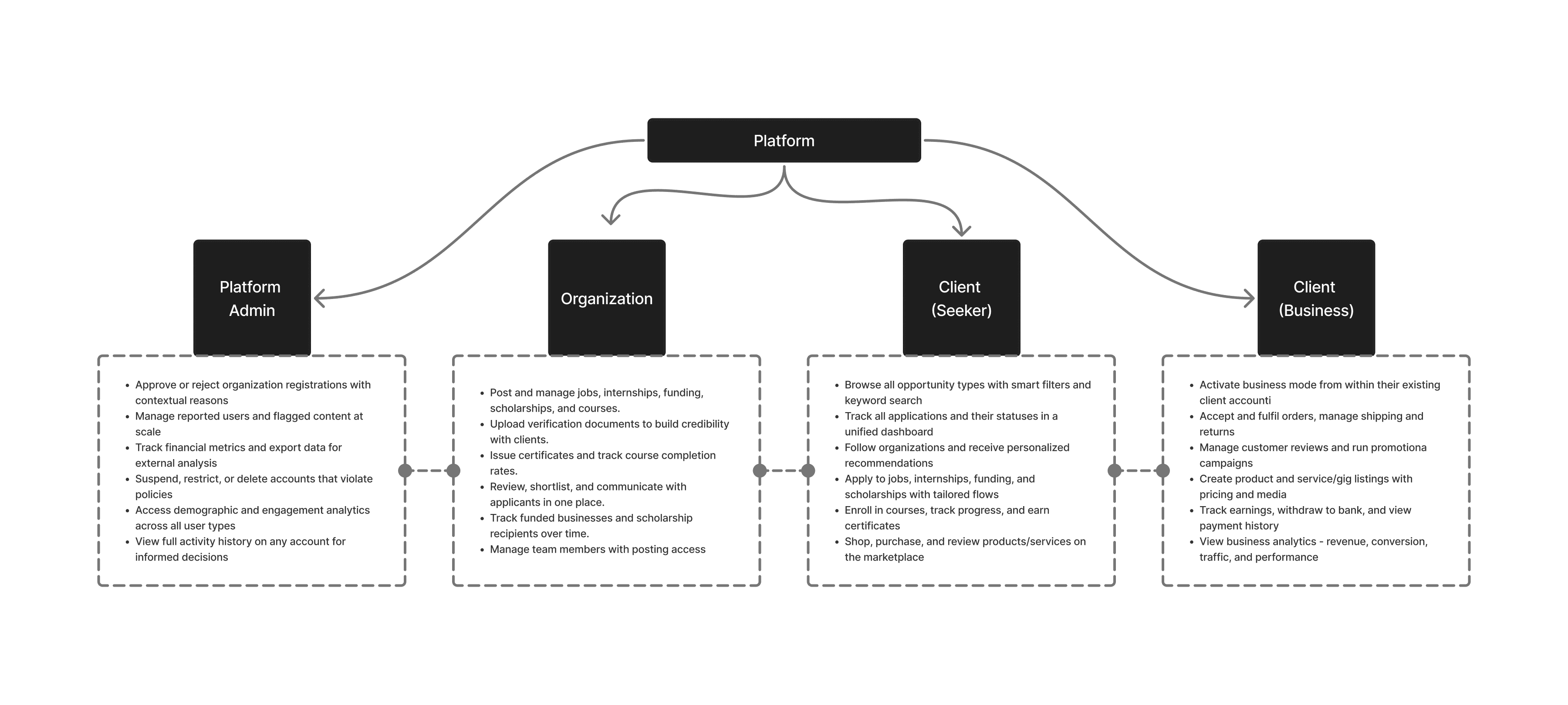
Structuring the platform by role
Rather than one monolithic navigation, FursaHub uses role-specific app contexts. Each user type gets a tailored IA but shared infrastructure (auth, messaging, payments, notifications) is unified beneath the surface.
Choices that shaped the product
Role-based app contexts, not role-based views
Rather than a single app with toggled permissions, each user type (admin, org, client) gets a distinct navigational context reducing cognitive overload and keeping each experience purposeful.
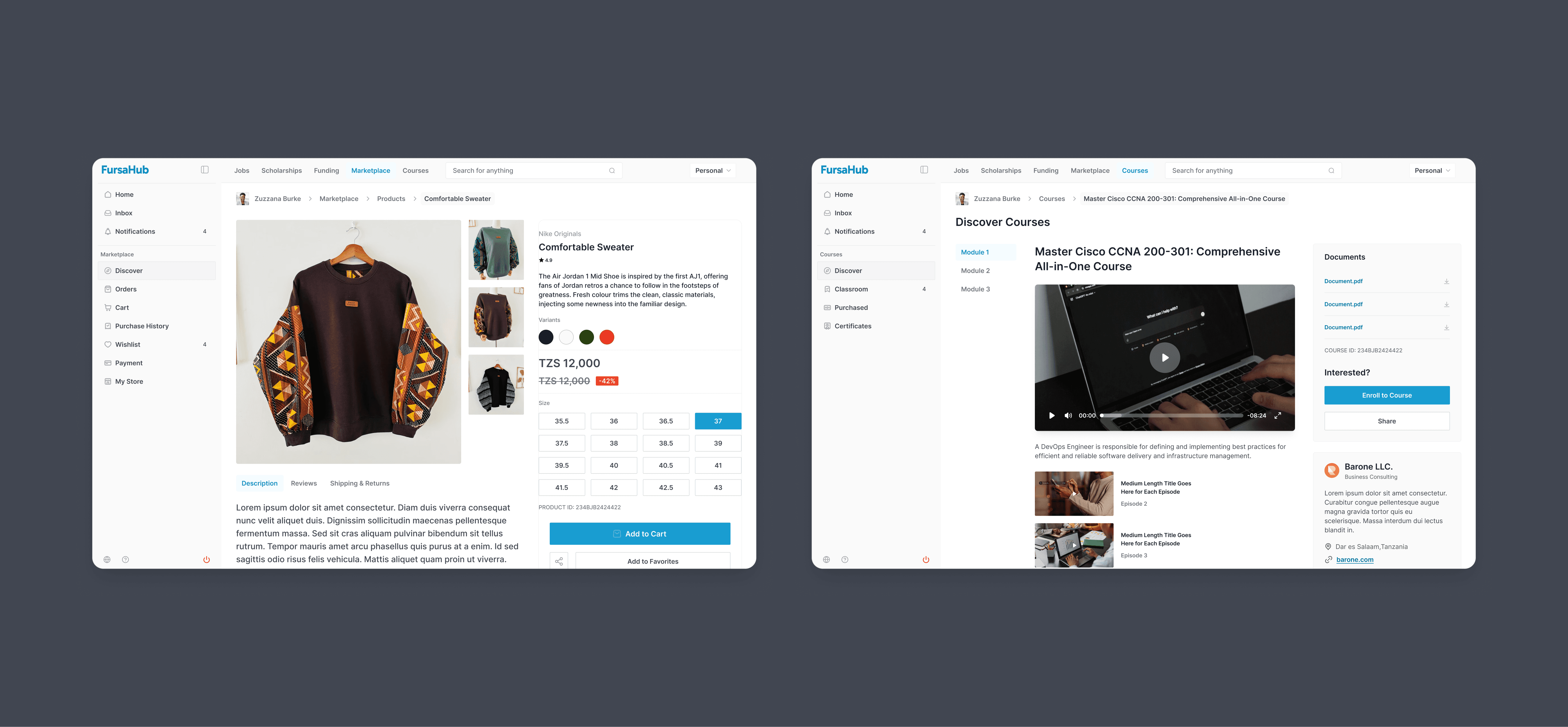
Business mode as a mode switch, not a separate account
Clients who want to sell activate "business mode" from within their existing profile preserving their identity while unlocking a seller overlay. This avoids login-juggling and mirrors patterns from platforms like Airbnb.
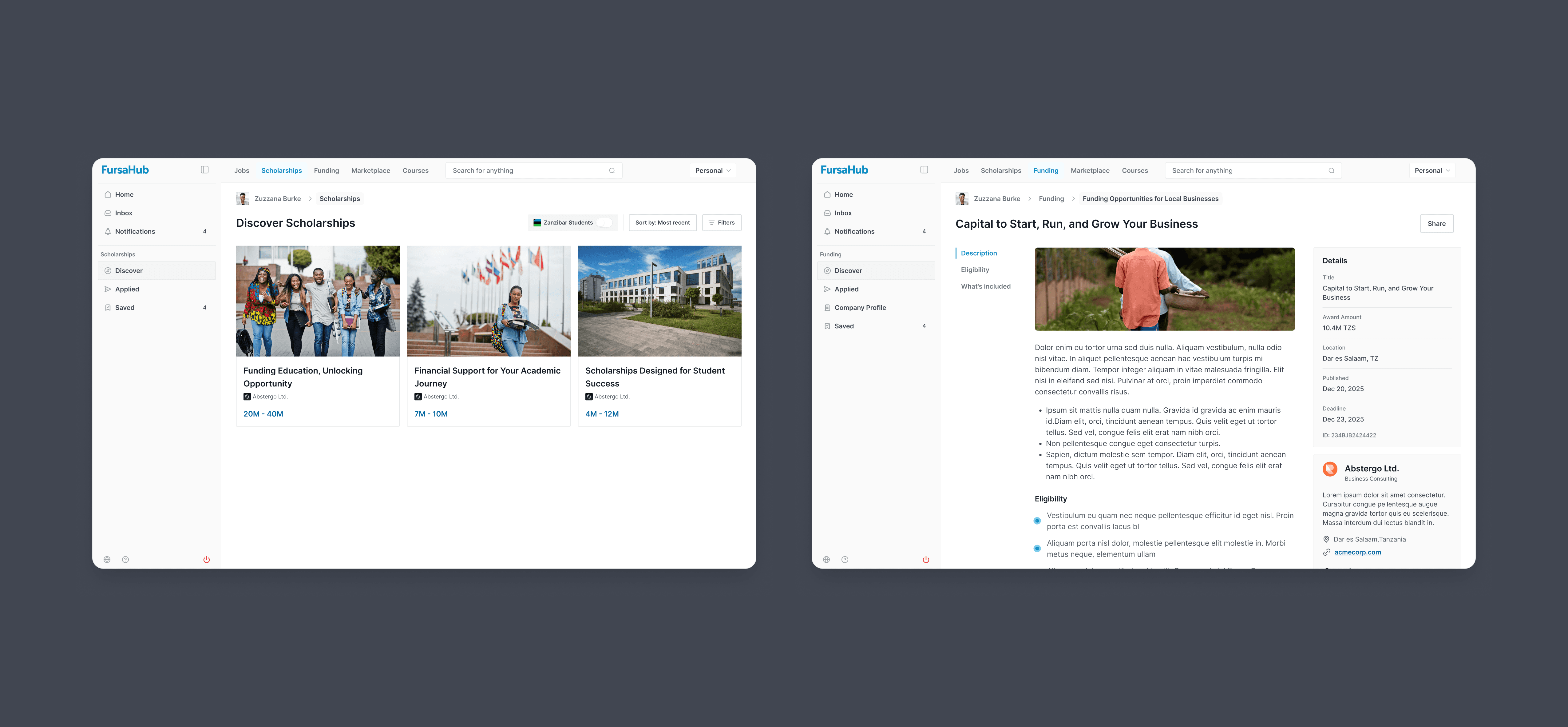
Opportunity type as a section, not a single filter
All five opportunity types (jobs, internships, funding, scholarships, courses) live in separate sections. Clients navigate to separate sections reducing friction and encouraging discovery.
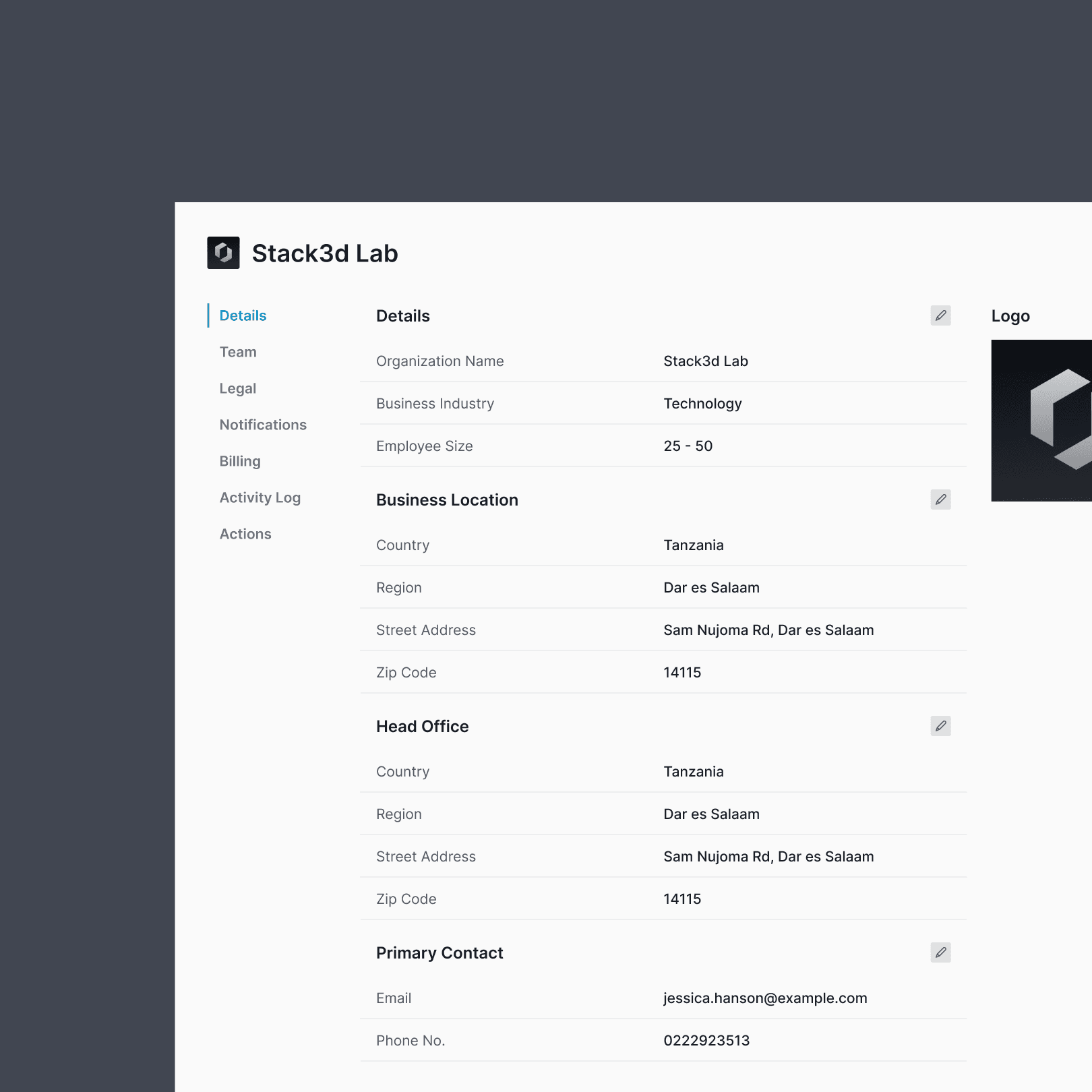
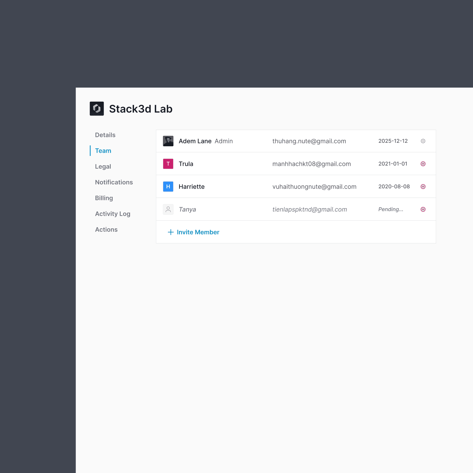
Trust baked into the architecture
Organization verification, client reviews, a dedicated admin approval queue, and a reporting system were designed in from day one not added later. Trust infrastructure was treated as a core UX feature, not a safety afterthought.
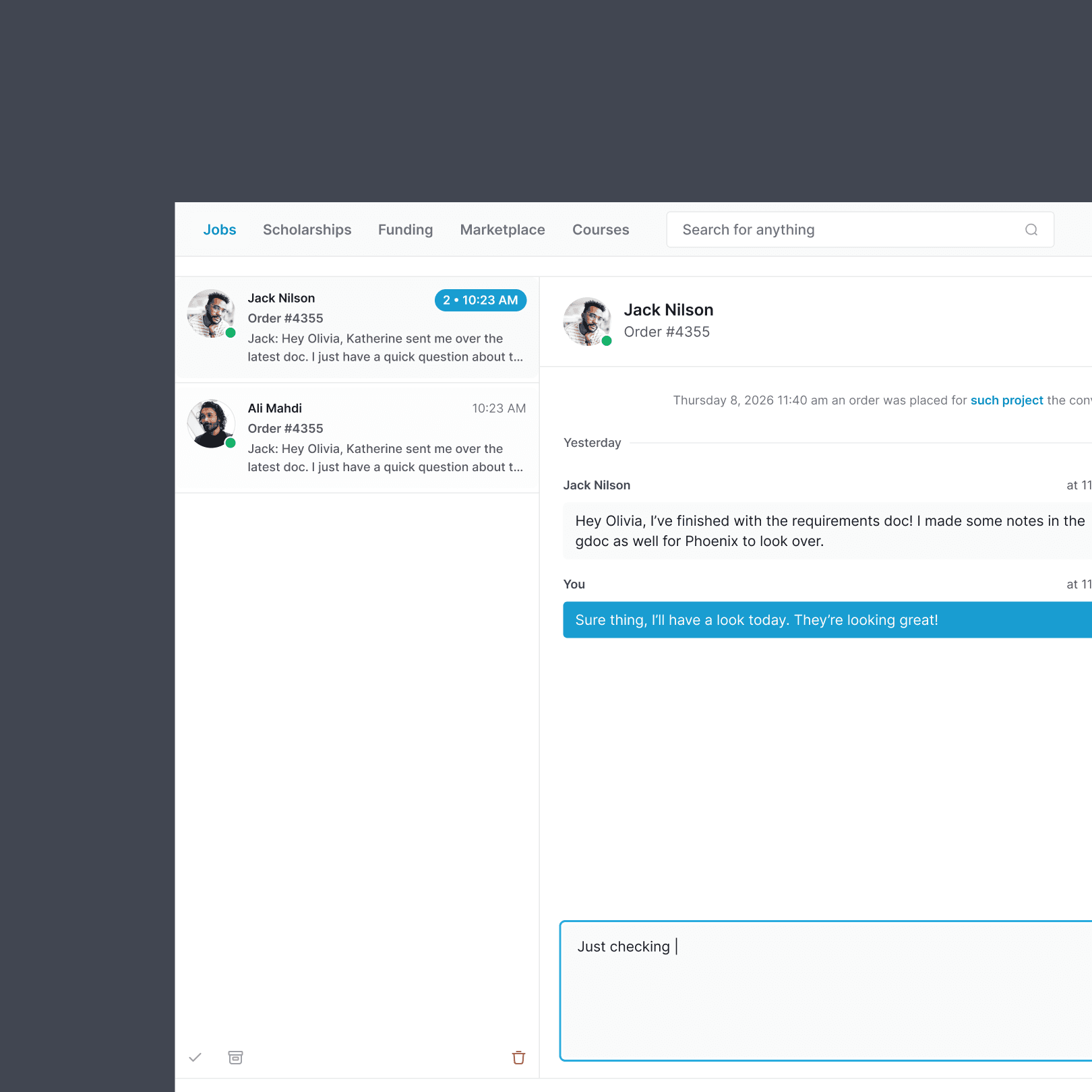
Unified messaging across all contexts
Whether a client is messaging an org about an application or a buyer chatting with a seller, all communication routes through one inbox keeping context visible and reducing the need to switch between screens.
What I learned
Designing FursaHub taught me that complexity isn't the enemy confusion is. When a platform serves multiple user types with deeply different goals, the solution isn't to simplify everything down to a lowest common denominator. It's to give each user a purposeful, focused experience, while making sure the connective tissue underneath is rock solid.
The hardest design problem was the client dual role. A person can wake up, apply for a scholarship, then spend the afternoon managing orders for their small business and they need the product to feel coherent throughout.
That required thinking carefully about mode switching, shared state, and how identity surfaces across the product.
More