BACK
Shilingi
The Problem I Couldn't Ignore
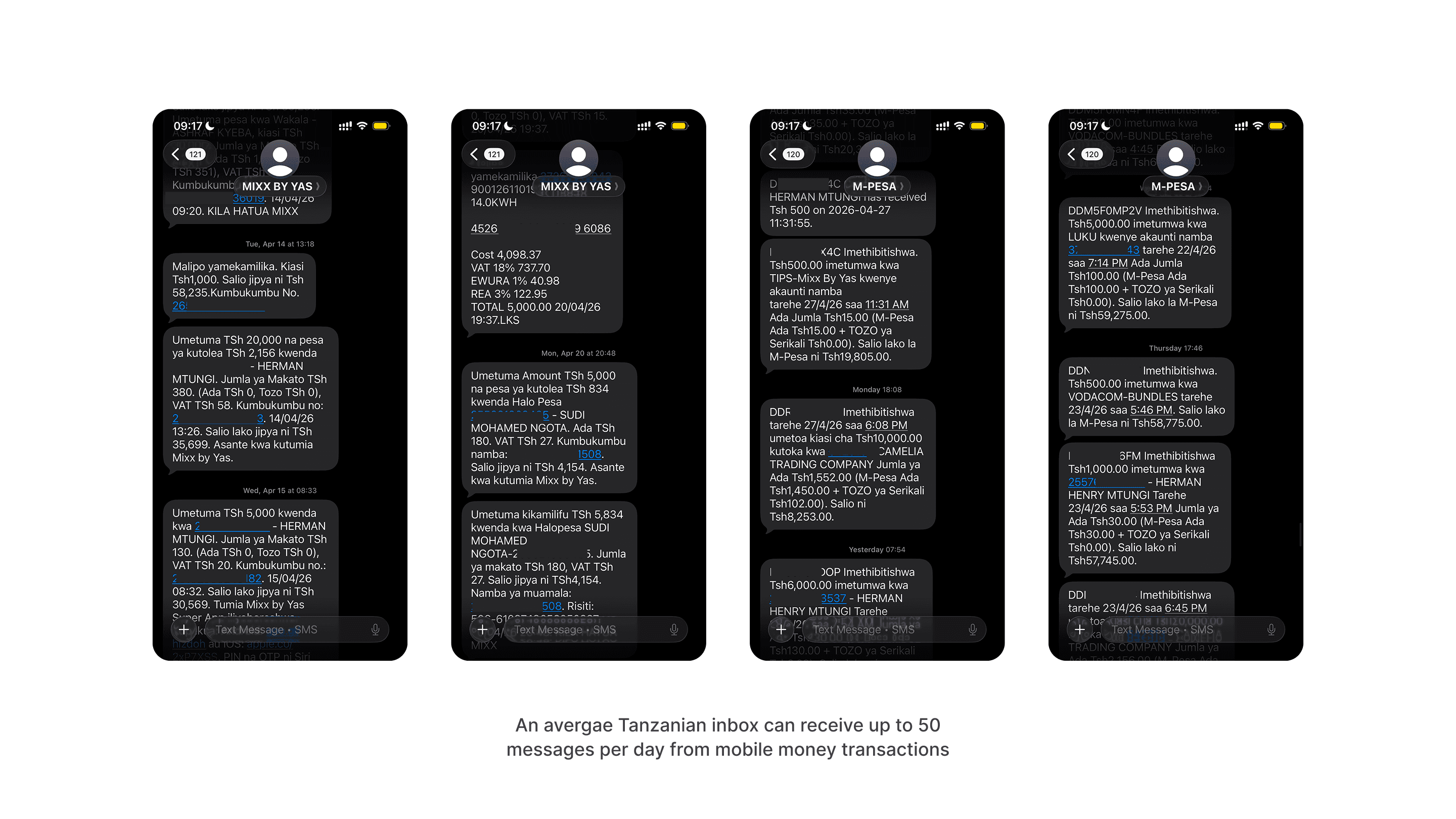
My family uses mobile money every single day. M-Pesa for the big transfers, Airtel for the smaller ones, Mixx by Yas when the others are slow. Three providers, three apps, three separate inboxes full of SMS alerts.
One evening I asked my mother how much she'd spent that month. She didn't know. She opened her SMS inbox and started scrolling.
"The information is there. But it's lost."
My Role | Duration | Platforms | Status |
Product Designer | 2 Weeks | Mobile | Testing |
That single moment became the brief for this project. Not a vague market opportunity a real person, scrolling through 300 messages, trying to find where her money went.
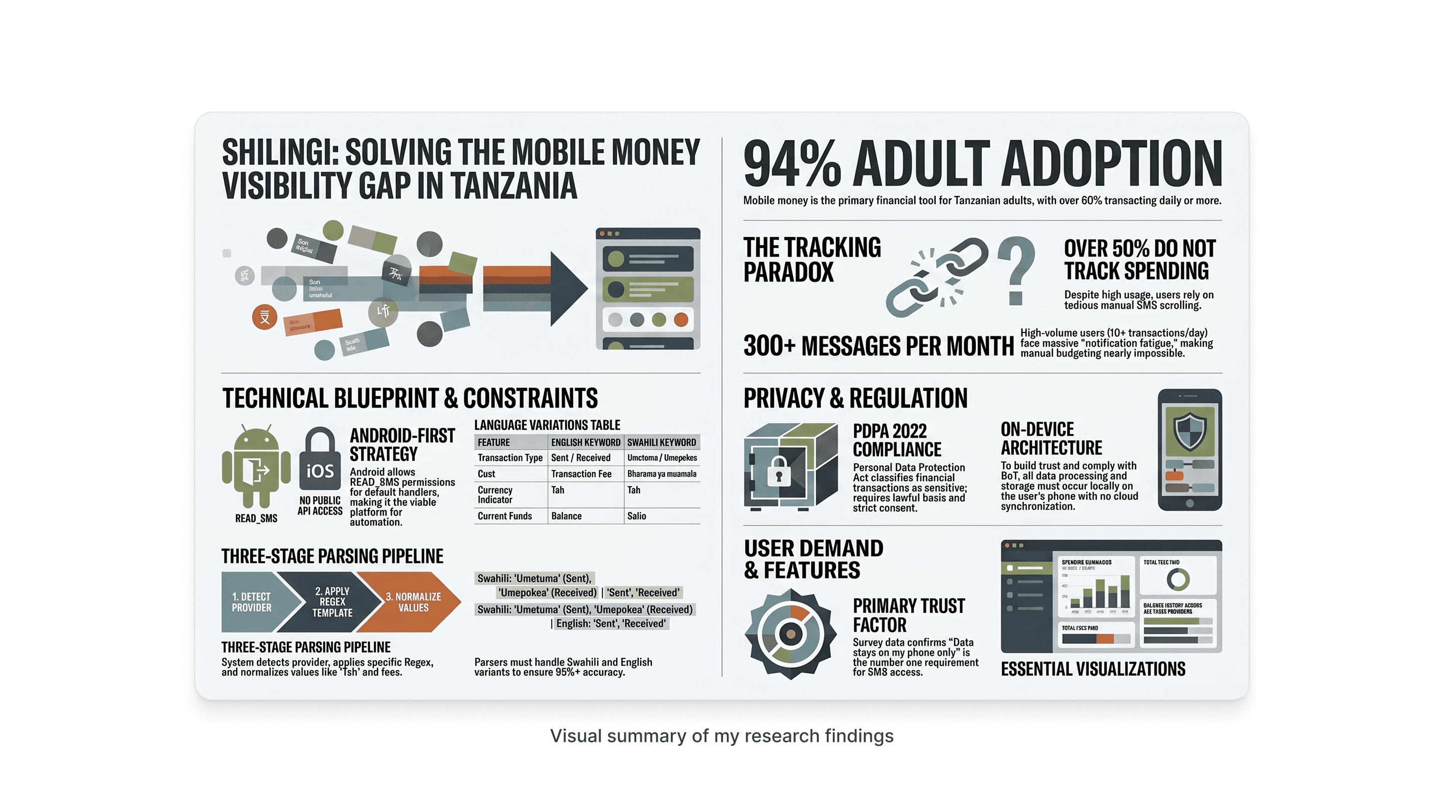
The Research: Finding Out How Widespread It Was
Before designing anything, I needed to know if this was my mother's problem or everyone's problem. I built a survey in Tally and sent it out across WhatsApp the fastest research channel in Dar es Salaam. 16 responses in 48 hours.
81% don't know how much they paid in fees last month
62% track money by scrolling through SMS
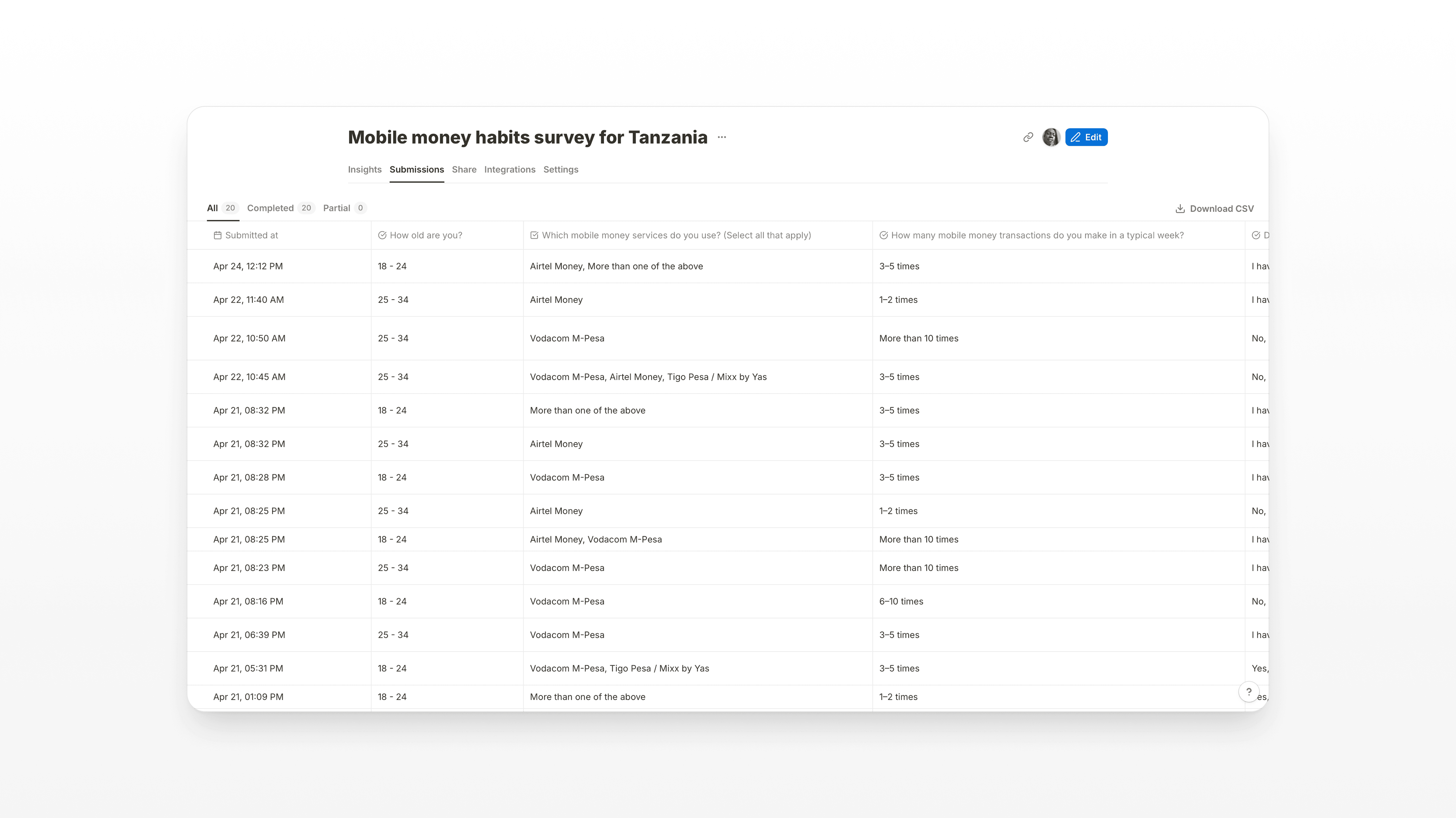
View survey results here
The quotes from respondents confirmed it wasn't just numbers:
"They send lots of messages with a lot of technical terms and numbers, I sometimes have a hard time reading through them."
"Mostly by scrolling through the messages. Besides that, the information is lost."
The obstacle was clear: Tanzanians have built a world-class mobile money ecosystem, and then left people to navigate it with a 160-character notification system that was never designed to be a ledger.
Video Summary
[Coming Soon]
The Insight: It's Not a Budgeting Problem
Most personal finance apps try to solve budgeting. Shilingi solves something different: visibility. Users aren't failing to budget because they lack willpower. They're failing because the data they need is scattered, buried, and technically complex.
The design challenge was to take something that felt overwhelming 300+ SMS alerts a month from 3 different providers in two languages and turn it into something a person could glance at and understand in under 30 seconds.
Research:
Key Design Decisions
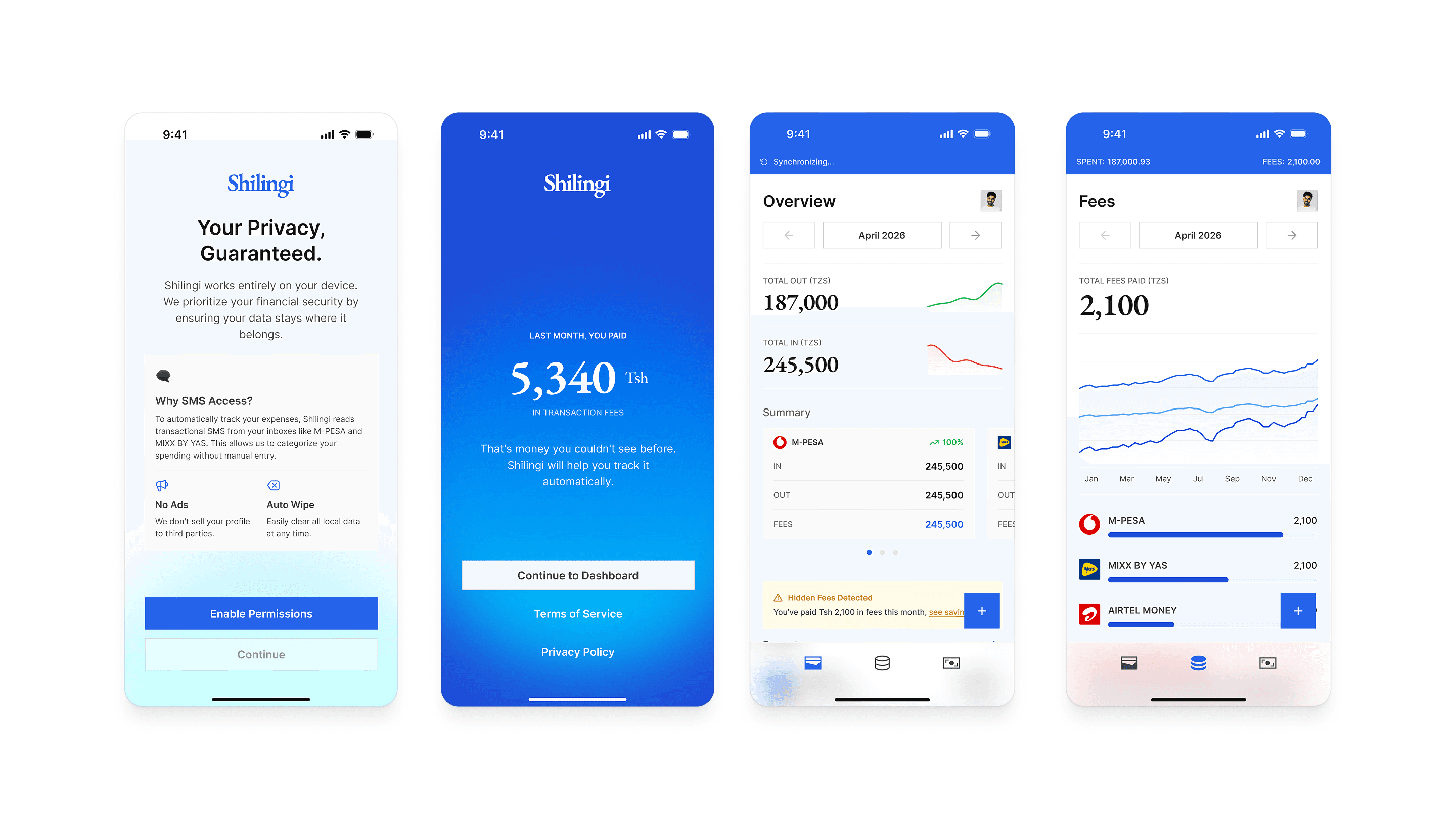
1. No default SMS handler required
The obvious technical approach making Shilingi the device's default messaging app would have killed onboarding. Nobody replaces Messages with a finance tracker. Instead, I designed around Android's READ_SMS permission with a BroadcastReceiver. One permission prompt, no displacement of existing apps.
2. User-selected sender threads, not hardcoded IDs
Sender names aren't standardised. One user sees 'M-PESA', another sees 'MPESA', another 'Vodacom M-Pesa'. Tigo became Mixx by Yas mid-product. Hardcoding breaks silently. So instead, the app reads unique sender names from the user's own inbox and asks them to select which ones are mobile money. The user defines the sources the app just listens.
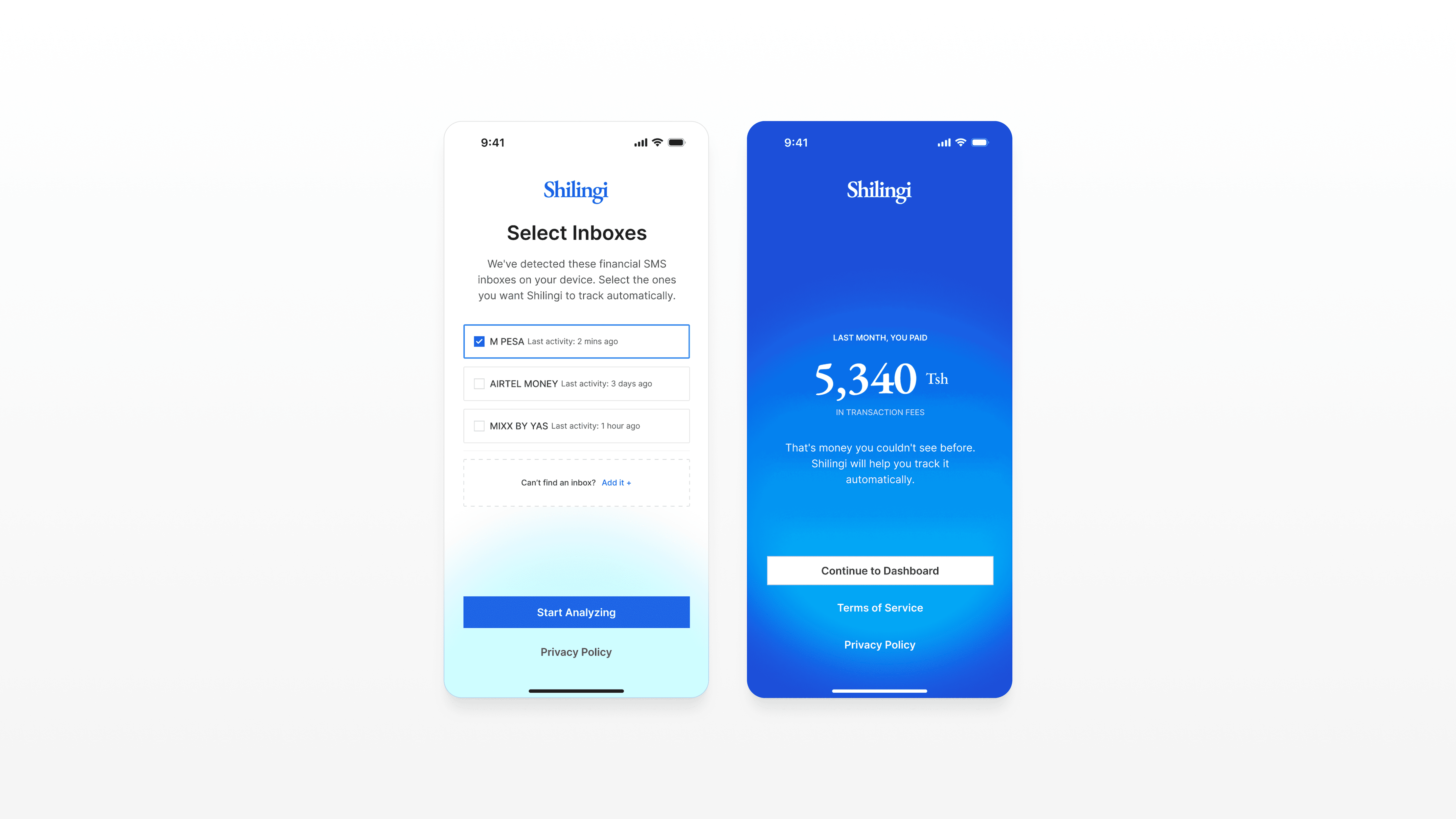
3. The fee revelation as the onboarding hook
81% of users had no idea how much they paid in fees last month. That number their actual cumulative fee total became the final screen of onboarding. Not a feature list. Not a dashboard tour. Just: 'Last month, you paid Tsh 5,340 in fees.' That's the moment the product earns the user's attention.
4. Income as a filter, not a feature
Early designs had a separate 'Income' tab. It added complexity without adding proportional value. Survey respondents didn't ask to track income they asked to understand where their money went. So income tracking became a simple toggle on the Transactions and Overview tabs. Same data, zero additional cognitive load.
5. Fees tab with progressive disclosure
A Fees tab with no data is worse than no Fees tab at all it looks broken. So the tab only appears in the bottom nav after 7 days of parsed data. Before that, a fee summary card inside Overview teases the insight and drives users toward that moment of revelation.
Navigation Structure
Three tabs. Each one answers a different question a user actually asks:
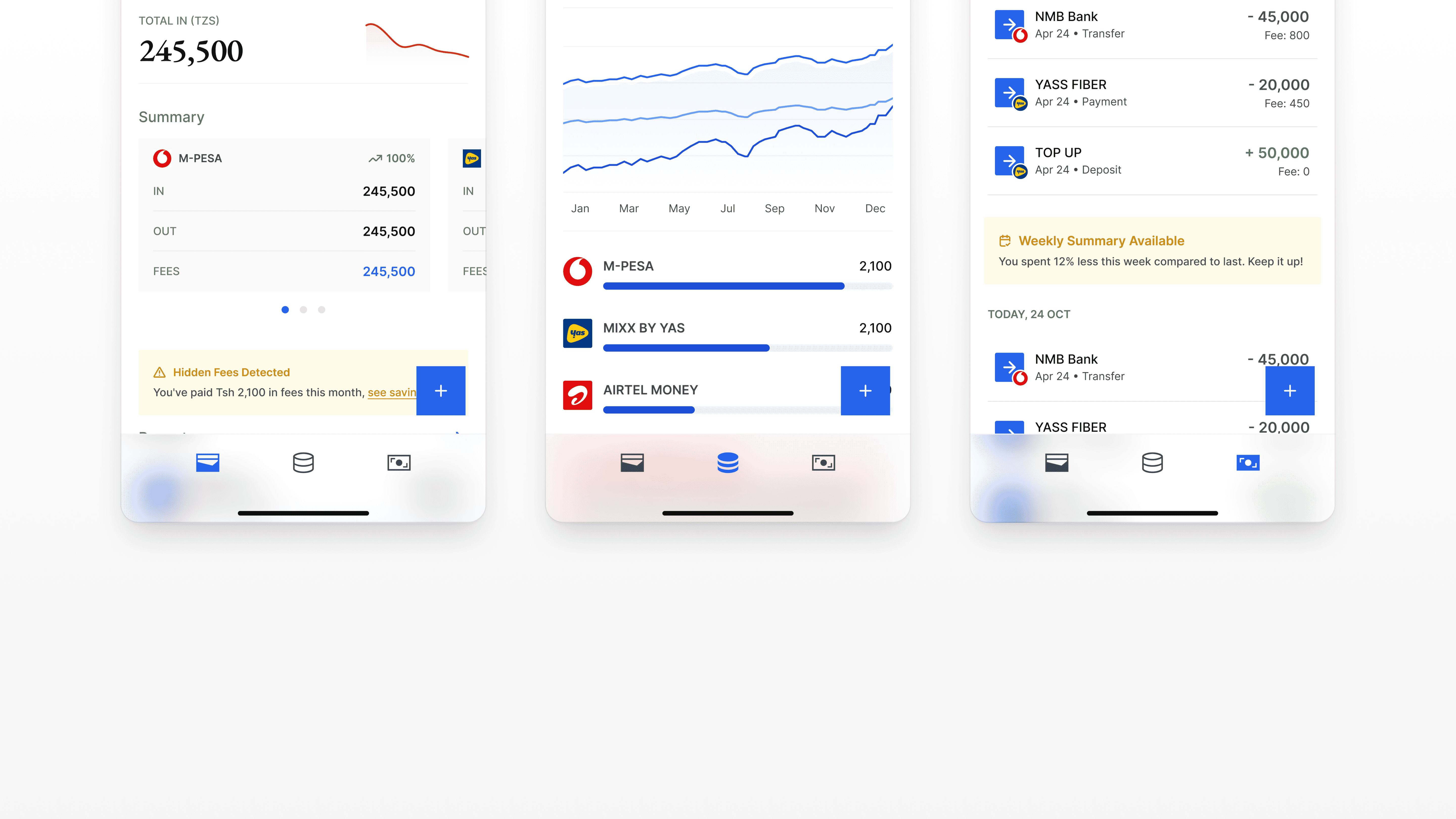
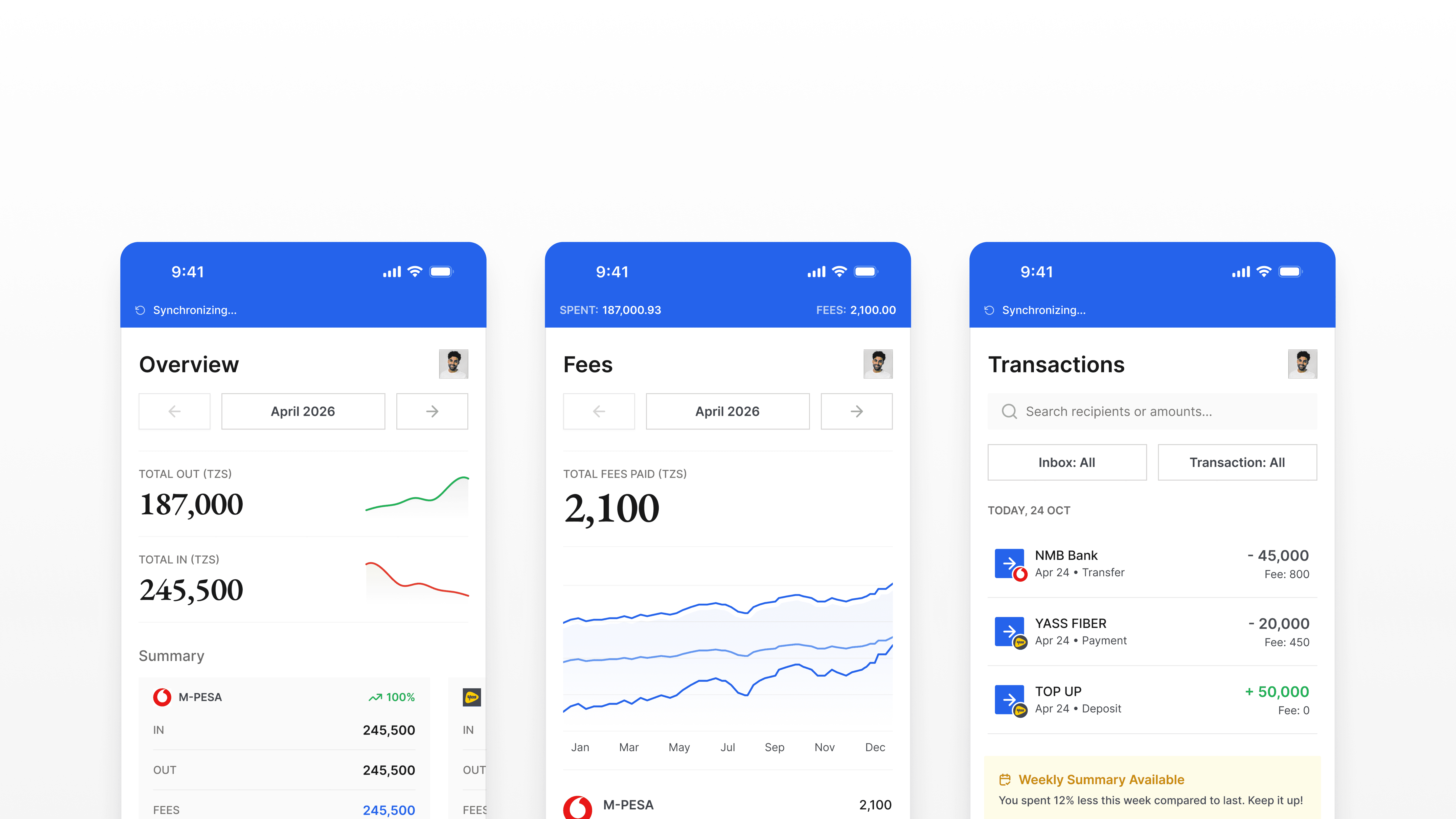
Overview: 'How much did I spend this month?'
Fees: 'How much am I losing to transaction fees?'
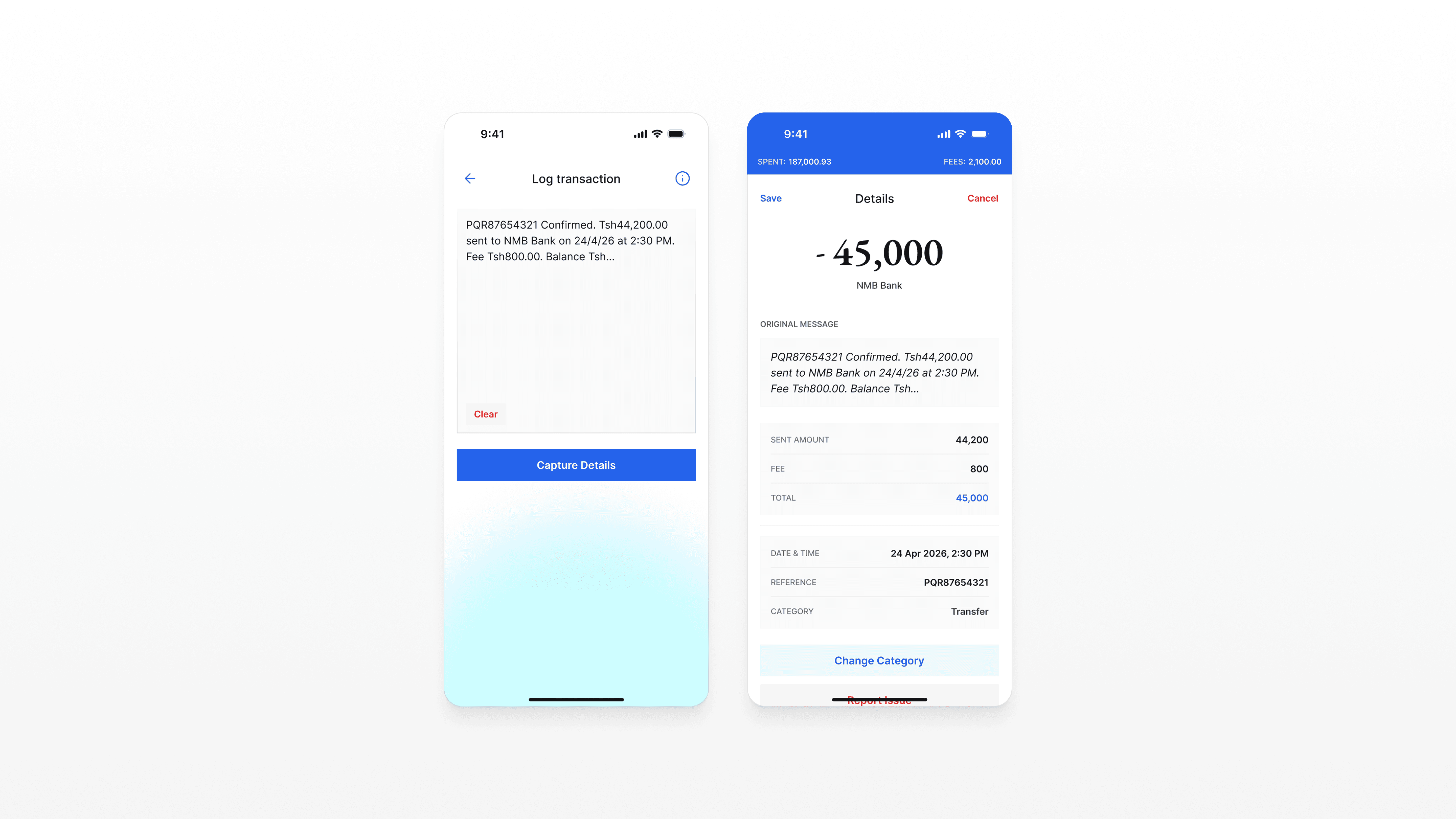
Transactions: 'Where did that specific payment go?'
A persistent header strip sits above all three tabs, always showing total spent and total fees for the current month. The user's most important numbers are never more than a glance away, regardless of which tab they're on.
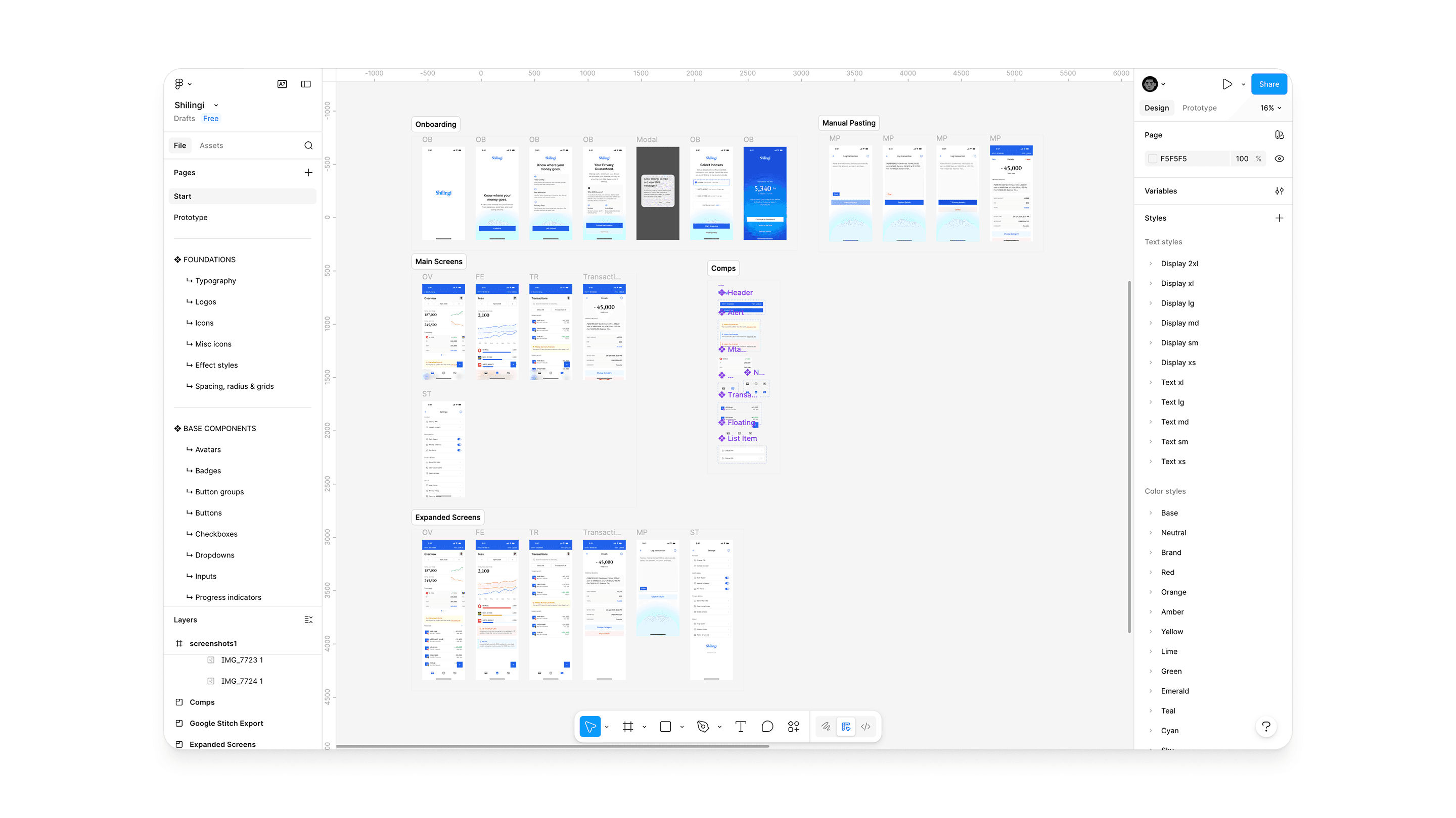
The Prototype
I designed the full app in Figma 6 onboarding screens, 3 main tabs with expanded states, manual SMS paste flow with parsing states, transaction detail, and settings. Then using Figma Make, I built a working React prototype that simulates a fraction of the experience.
You can access the limited prototype here
What I Learned
The most important design decision on this project wasn't a screen or a component. It was choosing to start with a conversation with my mother rather than a competitor analysis. The research gave me something no competitor analysis could: a real person's frustration, in their own words, that I could design directly toward.
The second lesson: trust is a design problem. 81% of users would only trust this app if their data stayed on their phone. That wasn't a constraint it became the architecture, the onboarding copy, and the primary marketing message.
You can read more on the research I made:
More